 RSS Feed
 by Calculated Risk on 11/28/2020 07:07:00 PM
Saturday, November 28, 2020
November 28 COVID-19 Test Results; Record Hospitalizations
Note: The data will be unusual over the holiday weekend. Stay Safe!!!
The US is now averaging over 1 million tests per day. Based on the experience of other countries, for adequate test-and-trace (and isolation) to reduce infections, the percent positive needs to be well under 5% (probably close to 1%), so the US still needs to increase the number of tests per day significantly (or take actions to push down the number of new infections).
There were 1,419,105 test results reported over the last 24 hours.
There were 152,098 positive tests.
Almost 35,000 US deaths have been reported so far in November. See the graph on US Daily Deaths here.
 Click on graph for larger image.
This data is from the COVID Tracking Project.
The percent positive over the last 24 hours was 10.7% (red line is 7 day average). The percent positive is calculated by dividing positive results by the sum of negative and positive results (I don't include pending).
And check out COVID Exit Strategy to see how each state is doing.
 The second graph shows the 7 day average of positive tests reported and daily hospitalizations.
The dashed line is the previous hospitalization maximum.
Note that there were very few tests available in March and April, and many cases were missed, so the hospitalizations was higher relative to the 7-day average of positive tests in July.
• Record Hospitalizations.
Schedule for Week of November 29, 2020
by Calculated Risk on 11/28/2020 08:23:00 AM
The key report this week is the November employment report on Friday.
Other key indicators include the November ISM manufacturing and services indexes, November auto sales, and the October trade deficit.
On Tuesday and Wednesday, Fed Chair Powell will provide testimony on the "Coronavirus Aid, Relief, and Economic Security Act".
----- Monday, Nov 30th -----
9:45 AM: Chicago Purchasing Managers Index for November.
10:00 AM: Pending Home Sales Index for October. The consensus is for a 2.0% increase in the index.
10:30 AM: Dallas Fed Survey of Manufacturing Activity for November. This is the last of the regional Fed manufacturing surveys for November.
----- Tuesday, Dec 1st -----
 10:00 AM: ISM Manufacturing Index for November. The consensus is for 57.5%, down from 59.3%.
Here is a long term graph of the ISM manufacturing index.
The PMI was at 59.3% in October, the employment index was at 53.2%, and the new orders index was at 67.9%.
10:00 AM: Construction Spending for October. The consensus is for 0.4% increase in spending.
10:00 AM: Testimony, Fed Chair Jerome Powell, Coronavirus Aid, Relief, and Economic Security Act, Before the Committee on Banking, Housing, and Urban Affairs, U.S. Senate
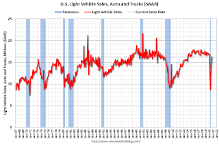 All day: Light vehicle sales for November.
The consensus is for 16.2 million SAAR in November, unchanged from the BEA estimate of 16.2 million SAAR in October (Seasonally Adjusted Annual Rate).
This graph shows light vehicle sales since the BEA started keeping data in 1967. The dashed line is the current sales rate.
----- Wednesday, Dec 2nd -----
7:00 AM ET: The Mortgage Bankers Association (MBA) will release the results for the mortgage purchase applications index.
8:15 AM: The ADP Employment Report for November. This report is for private payrolls only (no government). The consensus is for 420,000 jobs added, up from 365,000 in October.
10:00 AM: Testimony, Fed Chair Jerome Powell, Coronavirus Aid, Relief, and Economic Security Act, Before the Committee on Financial Services, U.S. House of Representatives
2:00 PM: the Federal Reserve Beige Book, an informal review by the Federal Reserve Banks of current economic conditions in their Districts.
----- Thursday, Dec 3rd -----
8:30 AM: The initial weekly unemployment claims report will be released. The consensus is for 825,000 initial claims, up from 778,000 last week.
10:00 AM: the ISM Services Index for November.
----- Friday, Dec 4th -----
 8:30 AM: Employment Report for November. The consensus is for 500 thousand jobs added, and for the unemployment rate to decrease to 6.7%.
There were 638 thousand jobs added in October, and the unemployment rate was at 6.9%.
This graph shows the job losses from the start of the employment recession, in percentage terms.
The current employment recession was by far the worst recession since WWII in percentage terms, and the worst in terms of the unemployment rate.
 8:30 AM: Trade Balance report for October from the Census Bureau.
This graph shows the U.S. trade deficit, with and without petroleum, through the most recent report. The blue line is the total deficit, and the black line is the petroleum deficit, and the red line is the trade deficit ex-petroleum products.
The consensus is the trade deficit to be $64.7 billion. The U.S. trade deficit was at $63.9 billion in September.
9:45 AM: Chicago Purchasing Managers Index for November.
10:00 AM: Pending Home Sales Index for October. The consensus is for a 2.0% increase in the index.
10:30 AM: Dallas Fed Survey of Manufacturing Activity for November. This is the last of the regional Fed manufacturing surveys for November.
 10:00 AM: ISM Manufacturing Index for November. The consensus is for 57.5%, down from 59.3%.
Here is a long term graph of the ISM manufacturing index.
The PMI was at 59.3% in October, the employment index was at 53.2%, and the new orders index was at 67.9%.
10:00 AM: Construction Spending for October. The consensus is for 0.4% increase in spending.
10:00 AM: Testimony, Fed Chair Jerome Powell, Coronavirus Aid, Relief, and Economic Security Act, Before the Committee on Banking, Housing, and Urban Affairs, U.S. Senate
 All day: Light vehicle sales for November.
The consensus is for 16.2 million SAAR in November, unchanged from the BEA estimate of 16.2 million SAAR in October (Seasonally Adjusted Annual Rate).
This graph shows light vehicle sales since the BEA started keeping data in 1967. The dashed line is the current sales rate.
7:00 AM ET: The Mortgage Bankers Association (MBA) will release the results for the mortgage purchase applications index.
8:15 AM: The ADP Employment Report for November. This report is for private payrolls only (no government). The consensus is for 420,000 jobs added, up from 365,000 in October.
10:00 AM: Testimony, Fed Chair Jerome Powell, Coronavirus Aid, Relief, and Economic Security Act, Before the Committee on Financial Services, U.S. House of Representatives
2:00 PM: the Federal Reserve Beige Book, an informal review by the Federal Reserve Banks of current economic conditions in their Districts.
8:30 AM: The initial weekly unemployment claims report will be released. The consensus is for 825,000 initial claims, up from 778,000 last week.
10:00 AM: the ISM Services Index for November.
 8:30 AM: Employment Report for November. The consensus is for 500 thousand jobs added, and for the unemployment rate to decrease to 6.7%.
There were 638 thousand jobs added in October, and the unemployment rate was at 6.9%.
This graph shows the job losses from the start of the employment recession, in percentage terms.
The current employment recession was by far the worst recession since WWII in percentage terms, and the worst in terms of the unemployment rate.
 8:30 AM: Trade Balance report for October from the Census Bureau.
 This graph shows the U.S. trade deficit, with and without petroleum, through the most recent report. The blue line is the total deficit, and the black line is the petroleum deficit, and the red line is the trade deficit ex-petroleum products.
The consensus is the trade deficit to be $64.7 billion. The U.S. trade deficit was at $63.9 billion in September.
Friday, November 27, 2020
November 27 COVID-19 Test Results
by Calculated Risk on 11/27/2020 07:52:00 PM
Note: The data will be unusual over the holiday weekend. Stay Safe!!!
The US is now averaging over 1 million tests per day. Based on the experience of other countries, for adequate test-and-trace (and isolation) to reduce infections, the percent positive needs to be well under 5% (probably close to 1%), so the US still needs to increase the number of tests per day significantly (or take actions to push down the number of new infections).
There were 1,703,640 test results reported over the last 24 hours.
There were 194,979 positive tests.
Over 33,000 US deaths have been reported so far in November. See the graph on US Daily Deaths here.
 Click on graph for larger image.
This data is from the COVID Tracking Project.
The percent positive over the last 24 hours was 11.4% (red line is 7 day average). The percent positive is calculated by dividing positive results by the sum of negative and positive results (I don't include pending).
And check out COVID Exit Strategy to see how each state is doing.
 The second graph shows the 7 day average of positive tests reported and daily hospitalizations.
The dashed line is the previous hospitalization maximum.
Note that there were very few tests available in March and April, and many cases were missed, so the hospitalizations was higher relative to the 7-day average of positive tests in July.
Hotels: Occupancy Rate Declined 32.6% Year-over-year
by Calculated Risk on 11/27/2020 01:45:00 PM
From HotelNewsNow.com: STR: US hotel results for week ending 21 November
U.S. weekly hotel occupancy continued to slip further from previous weeks, according to the latest data from STR through 21 November.Since there is a seasonal pattern to the occupancy rate - see graph below - we can track the year-over-year change in occupancy to look for any improvement. This table shows the year-over-year change since the week ending Sept 19, 2020:
15-21 November 2020 (percentage change from comparable week in 2019):
• Occupancy: 41.2% (-32.6%)
• Average daily rate (ADR): US$88.54 (-29.0%)
• Revenue per available room (RevPAR): US$36.45 (-52.2%)
emphasis added
| Week Ending | YoY Change, Occupancy Rate |
|---|---|
| 9/19 | -31.9% |
| 9/26 | -31.5% |
| 10/3 | -29.6% |
| 10/10 | -29.2% |
| 10/17 | -30.7% |
| 10/24 | -31.7% |
| 10/31 | -29.0% |
| 11/7 | -35.9% |
| 11/14 | -32.7% |
| 11/21 | -32.6% |
This suggests no improvement over the last 10 weeks.
The following graph shows the seasonal pattern for the hotel occupancy rate using the four week average.
 Click on graph for larger image.
The red line is for 2020, dash light blue is 2019, blue is the median, and black is for 2009 (the worst year since the Great Depression for hotels - before 2020).
Seasonally we'd expect the occupancy rate to decline into the new year. Note that there was little pickup in business travel that usually happens in the Fall.
Note: Y-axis doesn't start at zero to better show the seasonal change.
Q4 GDP Forecasts: Some Upward Revisions
by Calculated Risk on 11/27/2020 12:14:00 PM
From Merrill Lynch:
4Q GDP tracking jumped to 6.0% qoq saar as strong consumer, capex, housing and inventories data in October kicked the quarter off to a solid start. [Nov 25 estimate]From the NY Fed Nowcasting Report
The New York Fed Staff Nowcast stands at 2.8% for 2020:Q4. News from this week’s data releases decreased the nowcast by 0.1 percentage point. [Nov 27 estimate]And from the Altanta Fed: GDPNow
The GDPNow model estimate for real GDP growth (seasonally adjusted annual rate) in the fourth quarter of 2020 is 11.0 percent on November 25, up from 5.6 percent on November 18. [Nov 25 estimate]
Lawler: The Dismal Demographics of 2020
by Calculated Risk on 11/27/2020 09:35:00 AM
From housing economist Tom Lawler: The Dismal Demographics of 2020
Surging deaths, plummeting net international migration, and a likely further decline in births in 2020 should result in an astonishing slowdown in US population growth this year. Using reasonable assumptions for all three key “components of change,” US population growth from the end of 2019 to the end of 2020 will be only 0.22% (about 720,000).
Deaths
Beginning not too long ago the CDC began releasing provisional weekly estimates of US deaths – not just those attributable to Covid-19, but total deaths as well. While the data for much of this year is not complete – especially for the most recent weeks – because of reporting delays, the data nonetheless provide analysts with a general idea of the direction of deaths.
Below is a table comparing deaths by selected age groups over the 42-week period ending 10/24/2020 to deaths over the 42-week period ending 10/26/2019. (Data for 2020 have been released through the second week of November, but reporting delays massively understate deaths for the latest weeks available). Also shown are deaths directly attributable to Covid-19 through October 10/24/2020.
| CDC Estimates of US Deaths by Selected Age Groups | |||||||
|---|---|---|---|---|---|---|---|
| 42 Week End | < 25 | 25-44 | 45-64 | 65-74 | 75-84 | 85+ | Total |
| 10/19 | 49,620 | 117,263 | 441,782 | 456,373 | 563,456 | 714,483 | 2,342,977 |
| 10/20 | 51,588 | 141,364 | 498,681 | 525,081 | 637,739 | 789,072 | 2,643,525 |
| Covid 19 | 487 | 6,163 | 39,862 | 47,989 | 59,013 | 68,188 | 221,702 |
| Ex Covid | 51,101 | 135,201 | 458,819 | 477,092 | 578,726 | 720,884 | 2,421,823 |
| Total Delta | 4.0% | 20.6% | 12.9% | 15.1% | 13.2% | 10.4% | 12.8% |
| Ex-Covid Delta | 3.0% | 15.3% | 3.9% | 4.5% | 2.7% | 0.9% | 3.4% |
As the table shows, deaths in the US year-to-date in 2020 were at least 12.8% (or 300,548) above the comparable period of 2019, and deaths not directly attributable to Covid-19 were up at least 3.4% (or 78,846). Note that in % terms the biggest increase in deaths from a year ago has been in the 25-44 year old category. While the factors behind the increase in non-Covid-related deaths are not known, possible reasons include Covid-related deaths not identified as such, people not accessing medical treatment because of the pandemic, and what appears to be a substantial increase in the number of drug overdose deaths.
Projecting deaths for the balance of 2020 is tricky, though most experts are expecting that Covid-related deaths will turn back up in December. Using low-end projections for Covid deaths, below is a table showing what I believe is a reasonable (and probably slightly too low) projection of deaths in 2020 compared to 2019 (note that the 2019 numbers are an estimate based on weekly CDC data; the official report on US mortality in 2019 has not yet been released)
| Estimated US Deaths by Selected Age Groups (Calendar Year) | |||||||
|---|---|---|---|---|---|---|---|
| < 25 | 25-44 | 45-64 | 65-74 | 75-84 | 85+ | Total | |
| 2019 | 60,210 | 142,926 | 537,518 | 556,911 | 688,899 | 874,194 | 2,860,658 |
| 2020 | 62,506 | 172,279 | 608,652 | 642,866 | 780,598 | 963,183 | 3,230,084 |
| Delta | 2,296 | 29,353 | 71,134 | 85,955 | 91,699 | 88,989 | 369,426 |
| % Delta | 3.8% | 20.5% | 13.2% | 15.4% | 13.3% | 10.2% | 12.9% |
Net International Migration
There is little doubt that the pandemic, combined with a host of actions by the Administration, has resulted in a sharp reduction in both immigration to and emigration from the United States. Unfortunately, I do not know of any timely data sources that would enable one to estimate year-to-date net international migration. The last Census estimate of NIM was 595,000 for the 12 month period ending 6/30/2019. In my view, though not supported by data, I’d say an estimate of 250,000 for net international migration in 2020 seems plausible.
Births
While I do not know of any timely data on total US births in 2020, births have steadily declined over the past five years, and most experts expect that births were down slightly in 2020. Experts expect that the pandemic will ultimately result in a significant reduction in births, that decline will mainly show up in 2021. (There is a known lag between conception and birth!). The CDC’s provisional estimate for births was 3,745,540 in 2019 compared to 3,791,712 in 2018. A reasonable projection for 2020 would be around 3,700,000.
Adding Things Up
While the last official Census estimate of the US resident population was for July 1, 2019 (the so-called “Vintage 2019” estimate), Census also produced “Vintage 2019” one-year ahead population projections by month through December 1, 2020. (These should not be confused with Census’ long-term population projections, the latest of which was produced in 2017 and which are hopelessly out of date). While the projections for most of 2020 will be way too high, the projection for January 1, 2020 (pre-pandemic) are probably not too far off.
The “Vintage 2019” projection for the US residential population for January 1, 2020 was 329,135,084. If one assumes that the deaths, net international migration, and birth projections for 2020 are reasonable, then a reasonable projection for the US residential population on January 1, 2021 would be:
329,135,084 – 3,230,084 + 250,000 + 3,700,000 = 329,855,000.
Such an estimate would mean that the US resident population from the end of 2019 to the end of 2020 increased by just 719,916, or 0.22%. By comparison, US population growth from 2010 to 2016 averaged about 2.27 million a year (or 0.72% annual growth).
In a later report I will have estimates of the change in population by age groups. It appears, however, that from the end of 2019 to the end of 2020 the US working age population did not increase at all.
Black Knight: Number of Homeowners in COVID-19-Related Forbearance Plans Increased Slightly
by Calculated Risk on 11/27/2020 08:57:00 AM
Note: Both Black Knight and the MBA (Mortgage Bankers Association) are putting out weekly estimates of mortgages in forbearance.
This data is as of November 23rd.
From Black Knight: Forbearances Numbers See Another Slight Uptick
Our weekly snapshot of daily forbearance tracking data showed another slight uptick in active forbearance plans through Monday, November 23. It’s worth noting that this week’s data represents a slightly truncated view – normally, we report forbearance numbers through the Tuesday of any given week.
After rising by some 30,000 last week, active forbearances were up another 27,000 from last Tuesday.
We should keep in mind that mild increases like this have been common in the middle of the month. Since the recovery started, the strongest declines have typically been seen early in the month, as expiring forbearance plans are removed. The performance of the last two weeks has continued this trend.
...
Click on graph for larger image.
Despite this week’s increase, the number of active forbearances remains down 7% (-207,00) from last month, roughly equivalent to the declines we’d seen in August and September.
In total, as of November 23, there are now 2.78 million homeowners in active forbearance plans. Together, representing approximately 5.3% of all active mortgages – up from 5.2% from last week – they account for approximately $564 billion in unpaid principal.
emphasis added

Thursday, November 26, 2020
November 26 COVID-19 Test Results; Record Hospitalizations
by Calculated Risk on 11/26/2020 07:09:00 PM
Note: The data will show a decline over the holiday weekend due to less reporting. Stay Safe!!!
The US is now averaging over 1 million tests per day. Based on the experience of other countries, for adequate test-and-trace (and isolation) to reduce infections, the percent positive needs to be well under 5% (probably close to 1%), so the US still needs to increase the number of tests per day significantly (or take actions to push down the number of new infections).
There were 971,302 test results reported over the last 24 hours.
There were 125,082 positive tests.
Over 32,000 US deaths have been reported so far in November. See the graph on US Daily Deaths here.
 Click on graph for larger image.
This data is from the COVID Tracking Project.
The percent positive over the last 24 hours was 12.9% (red line is 7 day average). The percent positive is calculated by dividing positive results by the sum of negative and positive results (I don't include pending).
And check out COVID Exit Strategy to see how each state is doing.
 The second graph shows the 7 day average of positive tests reported and daily hospitalizations.
The dashed line is the previous hospitalization maximum.
Note that there were very few tests available in March and April, and many cases were missed, so the hospitalizations was higher relative to the 7-day average of positive tests in July.
• Record Hospitalizations.
Five Economic Reasons to be Thankful
by Calculated Risk on 11/26/2020 11:02:00 AM
First, thanks to all the healthcare workers and first responders that have been on the front lines saving lives. And to the essential workers that have kept the economy going. Thank you!
Even with these difficult times, here are five economic reasons to be thankful this Thanksgiving. (Hat Tip to Neil Irwin who started doing this several years ago)
1) Household Debt Burdens are at Record Lows.
Household debt burdens have declined sharply.
The Household debt service ratio (red) was at 13.2% in 2007, and has fallen to a series low of 8.69% in Q2 2020 (most recent data).
 Click on graph for larger image.
This graph, based on data from the Federal Reserve, shows the Total Debt Service Ratio (DSR), and the DSR for mortgages (blue) and consumer debt (yellow).
The consumer Debt Service Ratio (yellow) decreased in Q2 2020, and is near a series low. Note: The financial obligation ratio (FOR) declined in Q2 and is at a series low (not shown).
The DSR for mortgages (blue) is also at a series low (since at least 1980). This ratio increased rapidly during the housing bubble, and continued to increase until 2007.
With low interest rates, and a high savings rate, this data suggests aggregate household cash flow has improved.
2) New Home sales are at a Cycle High.
 This graph shows New Home Sales vs. recessions since 1963. The dashed line is the current sales rate.
New home sales were at 999 thousand SAAR (Seasonally Adjusted Annual Rate) in October, and 1.002 million SAAR in September (highest sales rate since 2006).
Sales are up almost four-fold from the cycle low of 270 thousand SAAR in February 2011.
Housing has been a strong sector during the pandemic, including new home sales, existing home sales and housing starts.
3) A Falling Unemployment Rate.
 The unemployment rate was at 6.9% in October. The unemployment rate is down from 14.7% in April 2020 (the highest since the Great Depression).
Unfortunately the unemployment rate significantly understates the current situation. Not only are 11 million people unemployed, another 3.7 million have left the labor force since February. And there are 2.3 million additional involuntary part time workers than a year ago
Still, this is significant improvement since April.
4) Falling unemployment claims.
 This graph shows seasonally adjust continued claims since 1967.
Continued claims decreased to 6.038 million (SA) last week, down from a peak of almost 25 million in May 2020.
This is a huge decline in regular unemployment claims.
Note: There are an additional 9,147,753 receiving Pandemic Unemployment Assistance (PUA) that increased from 8,681,647 the previous week. This is a special program for business owners, self-employed, independent contractors or gig workers not receiving other unemployment insurance.
An additional 4,509,284 are receiving Pandemic Emergency Unemployment Compensation (PEUC) that increased from 4,376,847 the previous week. These last two programs are set to expire on December 26th - so there is more disaster relief needed soon.
5) Science!
And finally, thanks to all the infectious disease experts and epidemiologists that have provided guidance on how to mitigate the risks of COVID (washing hands, wearing masks, social distancing, etc).
And thanks to the volunteers at the COVID Tracking Project. Data is essential in understanding what is happening. See: Data Heroes of Covid Tracking Project Are Still Filling U.S. Government Void
And thanks to the scientists developing therapeutics and vaccines. There is now a light at the end of the tunnel. Thank you.
A Happy and Safe Thanksgiving to All!
A Happy and Safe Thanksgiving to All!
Wednesday, November 25, 2020
November 25 COVID-19 Test Results; Record Hospitalizations, Deaths Increasing
by Calculated Risk on 11/25/2020 07:33:00 PM
Note: Week-over-week case growth has slowed, and will probably show a decline over the holiday weekend. However, it is likely that cases will pickup again the following week. Stay Safe!!!
The US is now averaging over 1 million tests per day. Based on the experience of other countries, for adequate test-and-trace (and isolation) to reduce infections, the percent positive needs to be well under 5% (probably close to 1%), so the US still needs to increase the number of tests per day significantly (or take actions to push down the number of new infections).
There were 1,329,565 test results reported over the last 24 hours.
There were 182,537 positive tests.
Almost 31,000 US deaths have been reported so far in November. See the graph on US Daily Deaths here.
 Click on graph for larger image.
This data is from the COVID Tracking Project.
The percent positive over the last 24 hours was 13.7% (red line is 7 day average). The percent positive is calculated by dividing positive results by the sum of negative and positive results (I don't include pending).
And check out COVID Exit Strategy to see how each state is doing.
 The second graph shows the 7 day average of positive tests reported and daily hospitalizations.
The dashed line is the previous hospitalization maximum.
Note that there were very few tests available in March and April, and many cases were missed, so the hospitalizations was higher relative to the 7-day average of positive tests in July.
• 7-day average cases are at a new record.
• 7-day average deaths at highest level since May.
• Record Hospitalizations.


