 RSS Feed
 by Calculated Risk on 6/20/2017 09:57:00 AM
Tuesday, June 20, 2017
Oil Prices Lower, Down Year-over-year
From CNBC: Oil prices are tumbling more than 2% to $43 a barrel right now
U.S. West Texas Intermediate crude oil futures were last down $1.19, or 2.7 percent, at $43.01.
 Click on graph for larger image
The first graph shows WTI and Brent spot oil prices from the EIA. (Prices today added).
According to Bloomberg, WTI is at $42.87 per barrel today, and Brent is at $45.69.
Prices really collapsed at the end of 2014 - and then rebounded a little - and then collapsed again at the end of 2015 and in early 2016.
Prices then rebounded to over $50 per barrel, but have been falling recently.
 The second graph shows the year-over-year change in WTI based on data from the EIA.
Six times since 1987, oil prices have increased 100% or more YoY. And several times prices have almost fallen in half YoY.
Currently WTI is down about 12% year-over-year.
Monday, June 19, 2017
Lawler: Single-Family Housing Production ‘Shortfall” All In Modestly Sized, Modestly Price Segment
by Calculated Risk on 6/19/2017 07:59:00 PM
A short note from housing economist Tom Lawler: Single-Family Housing Production ‘Shortfall” All In Modestly Sized, Modestly Price Segment
The number of US single-family homes completed last year that had at least 3,000 square feet of floor area (222,000). was higher than any year in the 20th Century save for the year 2000, when 224,000 of such really large homes were completed.
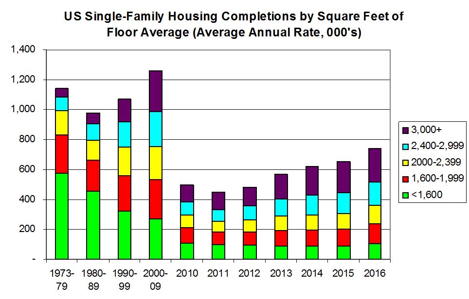
LEHC Estimates Based on Latest and Historical Census “Annual Characteristics of Housing”
Lawler: Early Read on Existing Home Sales in May
by Calculated Risk on 6/19/2017 01:58:00 PM
From housing economist Tom Lawler:
Based on publicly-available local realtor/MLS reports from across the country released through today, I project that US existing home sales as estimated by the National Association of Realtors ran at a seasonally adjusted annual rate of 5.65 million in May, up 1.4% from April’s preliminary pace and up 3.3% from last May’s seasonally adjusted pace. Unadjusted sales last month should show a larger YOY gain than seasonally adjusted sales. Local realtor/MLS data also suggest that existing home sales this May show a larger monthly increase than last May, and I project that the NAR’s estimate of the inventory of existing homes for sale in May will be 1.98 million, up 2.6% from April’s estimate and down 7.5% from last May. Finally, local realtor/MLS data suggest that the NAR’s estimate of the median existing single-family home sales price in May will be up by about 6.5% from last May.
CR Note: The NAR is scheduled to release existing home sales for May on Wednesday, June 21st. The consensus forecast is for sales of 5.55 million SAAR (take the over).
Hotels: Hotel Occupancy down Year-over-Year
by Calculated Risk on 6/19/2017 11:27:00 AM
From HotelNewsNow.com: STR: US hotel results for week ending 10 June
The U.S. hotel industry reported mixed year-over-year results in the three key performance metrics during the week of 4-10 June 2017, according to data from STR.The following graph shows the seasonal pattern for the hotel occupancy rate using the four week average.
In comparison with the week of 5-11 June 2016, the industry recorded the following:
• Occupancy: -0.8% to 73.0%
• Average daily rate (ADR): +1.5% to US$128.37
• Revenue per available room (RevPAR): +0.7% to US$93.73
emphasis added
 The red line is for 2017, dashed is 2015 (best year on record), blue is the median, and black is for 2009 (the worst year since the Great Depression for hotels).
Currently the occupancy rate is tracking close to last year, and just behind the record year in 2015.
For hotels, occupancy will increase further during the summer travel season.
Data Source: STR, Courtesy of HotelNewsNow.com
Q2 GDP Forecasts being Revised Down
by Calculated Risk on 6/19/2017 09:34:00 AM
From Merrill Lynch:
Housing starts were a big disappointment in May, plunging 5.5% to 1,092k saar from 1,156k in April. ... Feeding the data into our tracking model sliced 0.1pp from our 2Q estimate, leaving us at 2.2% qoq saar.From the Altanta Fed: GDPNow
The GDPNow model forecast for real GDP growth (seasonally adjusted annual rate) in the second quarter of 2017 is 2.9 percent on June 16, down from 3.2 percent on June 14. The forecast for second-quarter real residential investment growth decreased from 1.8 percent to 0.4 percent after this morning's housing starts release from the U.S. Census Bureau.From the NY Fed Nowcasting Report
emphasis added
The New York Fed Staff Nowcast stands at 1.9% for 2017:Q2 and 1.5% for 2017:Q3.
Sunday, June 18, 2017
Sunday Night Futures
by Calculated Risk on 6/18/2017 09:16:00 PM
Weekend:
• Schedule for Week of June 18, 2017
From CNBC: Pre-Market Data and Bloomberg futures: S&P futures are up 6 and DOW futures are up 40 (fair value).
Oil prices were down over the last week with WTI futures at $44.84 per barrel and Brent at $47.13 per barrel. A year ago, WTI was at $49, and Brent was at $50 - so oil prices are DOWN year-over-year.
Here is a graph from Gasbuddy.com for nationwide gasoline prices. Nationally prices are at $2.28 per gallon - a year ago prices were at $2.35 per gallon - so gasoline prices are down year-over-year.
Saturday, June 17, 2017
Schedule for Week of June 18, 2017
by Calculated Risk on 6/17/2017 08:09:00 AM
The key economic reports this week are New and Existing Home sales for May.
No major economic releases scheduled.
No major economic releases scheduled.
7:00 AM ET: The Mortgage Bankers Association (MBA) will release the results for the mortgage purchase applications index.
 10:00 AM: Existing Home Sales for May from the National Association of Realtors (NAR). The consensus is for 5.55 million SAAR, down from 5.57 million in April.
The graph shows existing home sales from 1994 through the report last month.
During the day: The AIA's Architecture Billings Index for May (a leading indicator for commercial real estate).
8:30 AM ET: The initial weekly unemployment claims report will be released. The consensus is for 240 thousand initial claims, up from 237 thousand the previous week.
9:00 AM: FHFA House Price Index for April 2017. This was originally a GSE only repeat sales, however there is also an expanded index.
11:00 AM: the Kansas City Fed manufacturing survey for June.
 10:00 AM ET: New Home Sales for May from the Census Bureau.
 This graph shows New Home Sales since 1963. The dashed line is the March sales rate.
The consensus is for an increase in sales to 590 thousand Seasonally Adjusted Annual Rate (SAAR) in May from 569 thousand in April.
Friday, June 16, 2017
Oil Rigs: "Smallest four week add since last year"
by Calculated Risk on 6/16/2017 08:25:00 PM
A few comments from Steven Kopits of Princeton Energy Advisors LLC on June 16, 2017:
• The party’s over. Oil prices are beginning to weigh on drilling activity.
• Total US oil rigs were up 6 to 747
• However, only 1 new horizontal oil rig was added, and only 3 in the last two weeks
• On a 4 wma basis, this is the smallest gain since last October
• $45 / barrel WTI appears to be a pain point for US shales
 Click on graph for larger image.
CR note: This graph shows the US horizontal rig count by basin.
Graph and comments Courtesy of Steven Kopits of Princeton Energy Advisors LLC.
Lawler: Reasonable Population Projections Are Important!
by Calculated Risk on 6/16/2017 03:48:00 PM
From housing economist Tom Lawler: Reasonable Population Projections Are Important!
One of the key variables analysts look at in attempting to project such things as housing demand, labor force growth, government “entitlement” spending, and a host of other key “macro” indicators is the projected population -- not just (or even mainly) the total population, of course, but more especially the age distribution of the population. At first glance, one might think that projecting the age distribution of the population would be rather simple: if you know your country’s current age distribution, you should, if your country has “closed borders,” be able to “walk forward” each individual age “cohort” using reasonable assumptions of death rates by age. However, we are not a “closed border” country, and as such, projections of the population by age also need to take into account “net international migration” by age, which encompasses both immigration by age and emigration (folks moving out of the country) by age.
Rather than making their own assumptions about death rates and net international migration, many analysts rely on “official” Census long-term population projections to produce forecasts of other variables. Sadly, however, such “official” projections are done infrequently, and the last “official” Census population projection was from late 2014, and is extremely out of date.
To remind folks, the 2014 Census long-term population projection incorporated an assumption that net international migration would increase materially beginning in 2014, and gradually increase from these unusually high levels through the next several decades. Updated population estimates through 2016, however, suggest that these net international migration assumptions through 2016 were way too high. In addition, recent data suggest that death rates over the past two years have been higher than those incorporated in the Census 2014 projections. As a result, the latest estimate of the US population as of July 1, 2016 is 868,105 lower than the projection from 2014, with the bulk of this projection “miss” coming in the 20-64 year old range.
In addition, the Census 2014 population projections did not (for obvious reasons) incorporate an assumption that Donald Trump would be elected president and that the House and Senate would be controlled by Republicans, and what that combination might mean in terms of likely net international migration trends over the remainder of the decade. Suffice it to say, the net international migration assumptions from the Census 2014 population projections from 2016 on are unrealistically high.
In sum, as is obvious, the “latest” long-term population projections from Census are extremely out of date, and are of little if any use to anyone. While Census does plan to issue a new long-term population projection around the end of this year, in the interim any analysts who wish to issue projections of any variables that depend on population forecasts must produce their own population projections.
 Click on graph for larger image.
Unfortunately for analysts, there is no clear or logical methodology to project net international migration over the next few years based on either the rhetoric or the policy “statements” from the Trump administration. However, one thing analysts can do is to show different population projection “scenarios” based on different net international migration assumptions.
One must first, of course, start with the latest available estimates of the US population, which are for July 1, 2016, and which are shown in the chart below.
 The chart highlights two “demographic” facts most folks are aware of: the high number of so-called “baby-boomers” set to near of reach retirement over the next several years, and the large number of “echo-boomers” who are currently “young adults.”
For sensitivity analysis, however, there are “shortcomings” of doing various scenarios from July 1, 2016: first, of course, that date is now almost a full year ago; and second, Trump “policies” probably have had only a modest impact on net international migration from July 1, 2016 until now.
As such, the “scenarios” I am showing are from July 1, 2017 to July 1, 2020. In estimating the age distribution of the population for 2017 I am assuming net international migration of 850,000, which is about 150,000 less than the latest estimate for 2016. I am using a similar age distribution for net international migration as that used in the Census 2014 projection, but I have adjusted assumptions on death rates to be consistent with the latest estimate for deaths in 2016 (which was higher than that assumed in the Census 2014 projection).
 The two scenarios I am showing for the US resident population by selected age groups are (1) zero net international migration (which in essence show how the existing population “ages); and (2) net immigration per year of 700,000 from July 1, 2017 through July 1, 2020. This assumption is, admittedly, somewhat arbitrary, but is “consistent” with a view that net international migration will be lower over the next 3 years than any three year period over the past two decade. For comparison I am also showing the population projections for 2016 through 2020 from the Census 2014 long-term population projection release.
| US Resident Population Projection by Selected Age Groups, Various "Scenarios", Thousands | ||||||
|---|---|---|---|---|---|---|
| Zero Net International Migration, 7/1/2017 - 7/1/2017 | ||||||
| 07/01/16 | 07/01/17 | 07/01/18 | 07/01/19 | 07/01/20 | 7/1/2017 - 7/1/2010 | |
| Total | 323,128 | 325,148 | 326,287 | 327,387 | 328,487 | 3,339 |
| 0-14 | 60,975 | 60,954 | 60,792 | 60,612 | 60,492 | -463 |
| 15-24 | 43,511 | 43,149 | 42,660 | 42,274 | 41,977 | -1,172 |
| 25-34 | 44,677 | 45,185 | 45,362 | 45,530 | 45,463 | 278 |
| 35-44 | 40,470 | 40,760 | 41,138 | 41,514 | 41,909 | 1,149 |
| 45-54 | 42,787 | 42,323 | 41,638 | 40,907 | 40,395 | -1,927 |
| 55-64 | 41,463 | 41,986 | 42,337 | 42,556 | 42,542 | 556 |
| 65-74 | 28,630 | 29,667 | 30,497 | 31,530 | 32,649 | 2,982 |
| 75+ | 20,614 | 21,124 | 21,863 | 22,464 | 23,060 | 1,936 |
| 25-54 | 127,934 | 128,268 | 128,138 | 127,951 | 127,767 | -500 |
| Net International Migration of 700,000 per Year from 7/1/2017 to 7/1/2020 | ||||||
| 07/01/16 | 07/01/17 | 07/01/18 | 07/01/19 | 07/01/20 | 7/1/2017 - 7/1/2010 | |
| Total | 323,128 | 325,148 | 326,987 | 328,785 | 330,580 | 5,433 |
| 0-14 | 60,975 | 60,954 | 60,906 | 60,832 | 60,811 | -143 |
| 15-24 | 43,511 | 43,149 | 42,863 | 42,663 | 42,532 | -618 |
| 25-34 | 44,677 | 45,185 | 45,544 | 45,908 | 46,048 | 863 |
| 35-44 | 40,470 | 40,760 | 41,223 | 41,690 | 42,183 | 1,423 |
| 45-54 | 42,787 | 42,323 | 41,682 | 40,997 | 40,533 | -1,789 |
| 55-64 | 41,463 | 41,986 | 42,373 | 42,626 | 42,648 | 662 |
| 65-74 | 28,630 | 29,667 | 30,522 | 31,583 | 32,730 | 3,063 |
| 75+ | 20,614 | 21,124 | 21,874 | 22,486 | 23,095 | 1,971 |
| 25-54 | 127,934 | 128,268 | 128,449 | 128,595 | 128,764 | 497 |
| Projections from Census 2014 Long-Term Population Forecast | ||||||
| 07/01/16 | 07/01/17 | 07/01/18 | 07/01/19 | 07/01/20 | 7/1/2017 - 7/1/2010 | |
| Total | 323,996 | 326,626 | 329,256 | 331,884 | 334,503 | 7,878 |
| 0-14 | 61,037 | 61,176 | 61,314 | 61,435 | 61,577 | 401 |
| 15-24 | 43,613 | 43,352 | 43,202 | 43,125 | 43,107 | -245 |
| 25-34 | 44,865 | 45,490 | 46,018 | 46,561 | 46,890 | 1,400 |
| 35-44 | 40,578 | 40,930 | 41,477 | 42,035 | 42,628 | 1,698 |
| 45-54 | 42,864 | 42,443 | 41,860 | 41,239 | 40,842 | -1,601 |
| 55-64 | 41,619 | 42,180 | 42,619 | 42,931 | 43,019 | 840 |
| 65-74 | 28,747 | 29,825 | 30,743 | 31,860 | 33,075 | 3,250 |
| 75+ | 20,674 | 21,230 | 22,023 | 22,697 | 23,366 | 2,136 |
| 25-54 | 128,306 | 128,863 | 129,356 | 129,836 | 130,360 | 1,496 |
To give folks an idea of how much different, below is a table of what labor force growth and US household formations would be under each scenario if (1) labor force participation rates by age remained constant at 2016 levels; and (2) household headship rates by age remain constant at my “best guess” rates for 2016 (there are no good, reliable data on households since 2010, but that is a different story!). I realize, of course, that holding labor force participation rates and headship rates by age constant is not a “best guess” projection, but I’m just trying to show sensitivities to different population assumptions.
| Annual Growth Rate in the US Labor Force Assuming Constant Labor Force Participation Rates by Age | |||
|---|---|---|---|
| 2018 | 2019 | 2020 | |
| Zero Net International Migration | 0.04% | 0.02% | -0.01% |
| NIM of 700,000/year | 0.28% | 0.27% | 0.24% |
| Census 2014 Projections | 0.50% | 0.50% | 0.48% |
| US Household Growth Assuming Constant Headship Rates by Age | |||
| 2018 | 2019 | 2020 | |
| Zero Net International Migration | 1,026,077 | 966,155 | 924,937 |
| NIM of 700,000/year | 1,231,995 | 1,180,916 | 1,148,645 |
| Census 2014 Projections | 1,485,278 | 1,455,615 | 1,442,362 |
As the table suggests, analysts using the extremely dated Census 2014 population projections would conclude that the US would have “decent” labor force growth and quite strong US household growth over the next three years. Contrary to what some analysts suggest, however, that strong growth is not in the main the result of the current “demographics” of the population, but rather is mainly the result of what are now clearly unrealistically high assumptions about net international migration. If instead the US had zero net international migration of the next three years, the US labor force would show no growth unless labor force participation rates increased, and US household growth would average less than one million per year unless headship rates increased. Not surprisingly, a “sorta Trumpy” scenario of net international migration of 700,000 a year – probably the closest there is a a “base case” scenario” produces projections about half way in between these two extremes.
Folks may differ about what is or is not a “reasonable” assumption for net international migration over the next three years, but what seems almost crystal clear is that the assumptions in the latest official long-term population projections from Census released in 2014 are not realistic, and should not be used by competent analysts. That is why it was so surprisingly that in today’s release of its annual “The State of the Nation’s Housing,” the Joint Center for Housing Studies at Harvard University stuck with the housing projections it made near the end of last year, which used … you guessed it --- the Census 2014 long-term population projections! While the JCHS report did note that net international migration could well be a LOT lower than that assumed in the Census 2014 population projections, its report did not give any indication of what a “reasonable” assumption might be, of how a “reasonable” (and much lower) assumption might impact its projections for US household formations (possibly because doing so involves a lot of work.)
Comments on May Housing Starts
by Calculated Risk on 6/16/2017 12:54:00 PM
Earlier: Housing Starts decreased to 1.092 Million Annual Rate in May
The housing starts report released this morning showed starts were down 5.5% in May compared to April, and were down 2.4% year-over-year compared to May 2016. This was a weak report and was well below the consensus forecast.
Note that multi-family starts are volatile month-to-month, and has seen wild swings over the last year - and has been especially weak over the last few months.
However, single family starts - although down in May compared to April - were up 8.5% year-over-year.
This first graph shows the month to month comparison between 2016 (blue) and 2017 (red).
 Click on graph for larger image.
Starts were down 2.4% in May 2017 compared to May 2016, and starts are up 3.2% year-to-date.
Note that single family starts are up 7.2% year-to-date, and the weakness (as expected) has been in multi-family starts.
My guess is starts will increase around 3% to 7% in 2017.
Below is an update to the graph comparing multi-family starts and completions. Since it usually takes over a year on average to complete a multi-family project, there is a lag between multi-family starts and completions. Completions are important because that is new supply added to the market, and starts are important because that is future new supply (units under construction is also important for employment).
These graphs use a 12 month rolling total for NSA starts and completions.
 The blue line is for multifamily starts and the red line is for multifamily completions.
The rolling 12 month total for starts (blue line) increased steadily over the last few years - but has turned down recently. Completions (red line) have lagged behind - but completions have been generally catching up (more deliveries). Completions lag starts by about 12 months.
I think the growth in multi-family starts is behind us - in fact, multi-family starts probably peaked in June 2015 (at 510 thousand SAAR) - although I expect solid multi-family starts for a few more years (based on demographics).
 The second graph shows single family starts and completions. It usually only takes about 6 months between starting a single family home and completion - so the lines are much closer. The blue line is for single family starts and the red line is for single family completions.
Note the exceptionally low level of single family starts and completions. The "wide bottom" was what I was forecasting following the recession, and now I expect a few years of increasing single family starts and completions.


