 RSS Feed
 by Calculated Risk on 7/29/2010 08:30:00 AM
Showing posts with label Employment. Show all posts
Showing posts with label Employment. Show all posts
Thursday, July 29, 2010
Weekly Initial Unemployment Claims: Eight Months of Moving Sideways
The DOL reports on weekly unemployment insurance claims:
In the week ending July 24, the advance figure for seasonally adjusted initial claims was 457,000, a decrease of 11,000 from the previous week's revised figure of 468,000. The 4-week moving average was 452,500, a decrease of 4,500 from the previous week's revised average of 457,000.
...
The advance number for seasonally adjusted insured unemployment during the week ending July 17 was 4,565,000, an increase of 81,000 from the preceding week's revised level of 4,484,000.
 Click on graph for larger image in new window.
This graph shows the 4-week moving average of weekly claims since January 2000.
The four-week average of weekly unemployment claims decreased this week by 4,500 to 452,500.
The dashed line on the graph is the current 4-week average.
The 4-week average of initial weekly claims has been at about the same level since December 2009 (eight months) and the 4-week average of 452,500 is high historically, and suggests a weak labor market.
Thursday, July 22, 2010
Weekly Initial Unemployment Claims increase to 464,000
by Calculated Risk on 7/22/2010 08:30:00 AM
The DOL reports on weekly unemployment insurance claims:
In the week ending July 17, the advance figure for seasonally adjusted initial claims was 464,000, an increase of 37,000 from the previous week's revised figure of 427,000. The 4-week moving average was 456,000, an increase of 1,250 from the previous week's revised average of 454,750.
...
The advance number for seasonally adjusted insured unemployment during the week ending July 10 was 4,487,000, a decrease of 223,000 from the preceding week's revised level of 4,710,000.
 Click on graph for larger image in new window.
This graph shows the 4-week moving average of weekly claims since January 2000.
The four-week average of weekly unemployment claims increased this week by 1,250 to 456,000.
The dashed line on the graph is the current 4-week average.
The 4-week average of initial weekly claims has been at about the same level since December 2009 (eight months) and the 4-week average of 456,000 is high historically, and suggests a weak labor market.
Tuesday, July 20, 2010
State Unemployment Rates: Generally lower in June
by Calculated Risk on 7/20/2010 10:03:00 AM
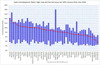 Click on graph for larger image in new window.
This graph shows the high and low unemployment rates for each state (and D.C.) since 1976. The red bar is the current unemployment rate (sorted by the current unemployment rate).
Sixteen states and D.C. now have double digit unemployment rates. Arizona and New Jersey are close.
Nevada set a new series high at 14.2% and now has the highest state unemployment rate. Michigan held the top spot for over 4 years until May.
From the BLS: Regional and State Employment and Unemployment Summary
Regional and state unemployment rates were generally lower in June. Thirty-nine states and the District of Columbia recorded unemployment rate decreases, five states had increases and six states had no change, the U.S. Bureau of Labor Statistics reported today.
...
Nevada again reported the highest unemployment rate among the states, 14.2 percent in June. The rate in Nevada also set a new series high. (All region, division, and state series begin in 1976.) The states with the next highest rates were Michigan, 13.2 percent; California, 12.3 percent; and Rhode Island, 12.0 percent.
emphasis added
Thursday, July 15, 2010
Weekly Initial Unemployment Claims decline to 429,000
by Calculated Risk on 7/15/2010 08:30:00 AM
The DOL reports on weekly unemployment insurance claims:
In the week ending July 10, the advance figure for seasonally adjusted initial claims was 429,000, a decrease of 29,000 from the previous week's revised figure of 458,000. The 4-week moving average was 455,250, a decrease of 11,750 from the previous week's revised average of 467,000.
...
The advance number for seasonally adjusted insured unemployment during the week ending July 3 was 4,681,000, an increase of 247,000 from the preceding week's revised level of 4,434,000.
 Click on graph for larger image in new window.
This graph shows the 4-week moving average of weekly claims since January 2000.
The four-week average of weekly unemployment claims decreased this week by 11,750 to 455,250.
The dashed line on the graph is the current 4-week average.
This is an improvement, and this is the lowest level for initial weekly claims since July 2008. The 4-week average of initial weekly claims has been at about the same level since December 2009 and the 4-week average of 455,250 is still high historically, and suggests a weak labor market.
Tuesday, July 13, 2010
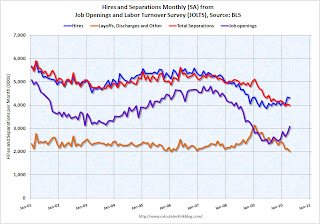
BLS: Low Labor Turnover in May
by Calculated Risk on 7/13/2010 10:41:00 AM
From the BLS: Job Openings and Labor Turnover Summary
There were 3.2 million job openings on the last business day of May 2010, the U.S. Bureau of Labor Statistics reported today. The job openings rate was little changed over the month at 2.4 percent. TheNote: The difference between JOLTS hires and separations is similar to the CES (payroll survey) net jobs headline numbers. The CES (Current Employment Statistics, payroll survey) is for positions, the CPS (Current Population Survey, commonly called the household survey) is for people.
hires rate (3.4 percent) was little changed and the separations rate (3.1 percent) was unchanged.
...
[T]he number of job openings has risen by 868,000 (37 percent) since the most recent trough of 2.3 million in July 2009. Even with the gains since July 2009, the number of job openings in May 2010 remained below those in place at the start of the recession in every industry except government, and in each region except the Northeast.
The following graph shows job openings (purple), hires (blue), Total separations (include layoffs, discharges and quits) (red) and Layoff, Discharges and other (yellow) from the JOLTS.
Unfortunately this is a new series and only started in December 2000.
 Click on graph for larger image in new window.
Notice that hires (blue) and separations (red) are pretty close each month. In May, about 4.1 million people lost (or left) their jobs, and 4.5 million were hired (this is the labor turnover in the economy).
When the hires (blue line) is above total separations (as in May), the economy is adding net jobs, when the blue line is below total separations, the economy is losing net jobs.
The hires in May included the 411 thousand temporary Census 2010 hires. Without those hires, the JOLTS report shows only 8 thousand hires in May.
Layoffs and discharges have declined sharply since early 2009 - and are near a series low - and that is a good sign. And the number of job openings has moved up recently (although down slightly in May). But the overall turnover, especially after removing the impact of the Census hiring, is still low.
Thursday, July 08, 2010
Weekly Initial Unemployment Claims decline to 454,000
by Calculated Risk on 7/08/2010 08:30:00 AM
The DOL reports on weekly unemployment insurance claims:
In the week ending July 3, the advance figure for seasonally adjusted initial claims was 454,000, a decrease of 21,000 from the previous week's revised figure of 475,000. The 4-week moving average was 466,000, a decrease of 1,250 from the previous week's revised average of 467,250.
...
The advance number for seasonally adjusted insured unemployment during the week ending June 26 was 4,413,000, a decrease of 224,000 from the preceding week's revised level of 4,637,000.
 Click on graph for larger image in new window.
This graph shows the 4-week moving average of weekly claims since January 2000.
The four-week average of weekly unemployment claims decreased this week by 1,250 to 466,000.
The dashed line on the graph is the current 4-week average.
Initial weekly claims have been at about the same level since December 2009. Historically the current level of 454,000, and 4-week average of 466,000, would suggest ongoing weakness in the labor market.
Friday, July 02, 2010
Employment Report: Temporary Help and Diffusion Index
by Calculated Risk on 7/02/2010 11:47:00 AM
This post is a little more technical ...
Temporary Help
From the BLS report:
Within professional and business services, employment continued to increase in temporary help services (+21,000). Employment in temporary help has risen by 379,000 since a recent low in September 2009.The following graph was used early this year as the basis for some optimistic employment forecasts.
 This graph is a little complicated. The red line is the three month average change in temporary help services (left axis). This is shifted four months into the future.
The blue line (right axis) is the three month average change in total employment (excluding temporary help services).
Unfortunately the data on temporary help services only goes back to 1990, but it does appear that temporary help leads employment by about four months.
The thinking is that before companies hire permanent employees following a recession, employers will first increase the hours worked of current employees (hours worked decreased slightly in June) and also hire temporary employees. After the number of temporary workers increased sharply late last year, some people thought this might be signaling the beginning of a strong employment recovery.
I was skeptical and joked that "We're all temporary now!" - and now temporary hiring is growing at a slower pace and it appears the hoped for surge in overall hiring didn't happen.
Note that the temporary hiring for the Census is excluded from this graph.
Diffusion Index
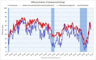 The BLS diffusion index for total private employment decreased to 52.2 from 54.8 in May. For manufacturing, the diffusion index is at 52.4; down sharply from 62.2 in May.
Think of this as a measure of how widespread job gains are across industries. The further from 50 (above or below), the more widespread the job losses or gains reported by the BLS. From the BLS:
Figures are the percent of industries with employment increasing plus one-half of the industries with unchanged employment, where 50 percent indicates an equal balance between industries with increasing and decreasing employment.The increase in the diffusion index earlier this year was one of the clear positives in the monthly employment reports. The decrease in the diffusion index in June (almost falling to 50%), is disappointing.
Earlier employment posts today:
Employment-Population Ratio, Part Time Workers, Unemployed over 26 Weeks
by Calculated Risk on 7/02/2010 09:53:00 AM
Here are a few more graphs based on the employment report ...
Percent Job Losses During Recessions, aligned at Bottom Click on graph for larger image.
This graph shows the job losses from the start of the employment recession, in percentage terms - but this time aligned at the bottom of the recession.
The current recession bounced along the bottom for a few months - so the choice of bottom is a little arbitrary (plus or minus a month or two).
The dotted line shows the impact of Census hiring. In June, there were 339,000 temporary 2010 Census workers on the payroll. The number of Census workers will continue to decline - and the gap between the solid and dashed red lines will be mostly closed in three or four months.
Employment-Population Ratio
The Employment-Population ratio decreased to 58.5% in June from 58.7% in May. This had been increasing after plunging since the start of the recession, and the recovery in the Employment-Population ratio was considered a good sign - but the ratio has now decreased for two consecutive months. This graph shows the employment-population ratio; this is the ratio of employed Americans to the adult population.
Note: the graph doesn't start at zero to better show the change.
The Labor Force Participation Rate decreased to 64.7% from 65.0% in May. This is the percentage of the working age population in the labor force. This decline is very disappointing, and the rate is well below the 66% to 67% rate that was normal over the last 20 years.
The reason the unemployment rate declined was because people left the workforce - and that is not good news. As the employment picture improves, people will return to the labor force, and that will put upward pressure on the unemployment rate.
Part Time for Economic Reasons  From the BLS report:
The number of persons employed part time for economic reasons (some times referred to as involuntary part-time workers), at 8.6 million, was little changed over the month but was down by 525,000 over the past 2 months. These individuals were working part time because their hours had been cut back or because they were unable to find a full-time job.The number of workers only able to find part time jobs (or have had their hours cut for economic reasons) was at 8.63 million in June. This slight decline was a little bit of good news.
The all time record of 9.24 million was set in October.
These workers are included in the alternate measure of labor underutilization (U-6) that was at 16.5% in June.
Unemployed over 26 Weeks
 The blue line is the number of workers unemployed for 27 weeks or more. The red line is the same data as a percent of the civilian workforce.
According to the BLS, there are 6.751 million workers who have been unemployed for more than 26 weeks and still want a job. This is a record 4.39% of the civilian workforce. (note: records started in 1948). It does appear the increases are slowing ... perhaps because people are giving up.
Summary
The underlying details of the employment report were mixed. The positives: the economy added 100 thousand payroll jobs ex-Census (still weak but better than in May), the unemployment rate decreased to 9.5%, the number of part time workers (for economic reasons) decreased slightly helping to push down U-6 to 16.5% (from 16.6%).
Negatives include the declines in the participation rate and employment-population rate, the slight decrease in hourly wages, the decline in average hours worked, and a record percent of workers unemployed for more than 26 weeks. The number of long term unemployed is one of the key stories of this recession, especially since many of them are now losing their unemployment benefits.
Overall this was a weak report.
Earlier employment post today:
June Employment Report: 100K Jobs ex-Census, 9.5% Unemployment Rate
by Calculated Risk on 7/02/2010 08:30:00 AM
From the BLS:
Total nonfarm payroll employment declined by 125,000 in June, and the unemployment rate edged down to 9.5 percent, the U.S. Bureau of Labor Statistics reported today. The decline in payroll employment reflected a decrease (-225,000) in the number of temporary employees working on Census 2010. Private-sector payroll employment edged up by 83,000.Census 2010 hiring decreased 225,000 in June. Non-farm payroll employment increased 100,000 in June ex-Census.
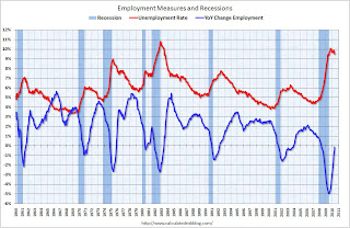 Click on graph for larger image.
This graph shows the unemployment rate and the year over year change in employment vs. recessions.
Nonfarm payrolls decreased by 125 thousand in June. The economy has lost 170 thousand jobs over the last year, and 7.5 million jobs since the recession started in December 2007.
Ex-Census hiring, the economy added 100,000 jobs in June. The unemployment rate fell to 9.5 percent.
 The second graph shows the job losses from the start of the employment recession, in percentage terms (as opposed to the number of jobs lost).
The dotted line is ex-Census hiring. The two lines will rejoin later this year when the Census hiring is unwound.
For the current employment recession, employment peaked in December 2007, and this recession is by far the worst recession since WWII in percentage terms, and 2nd worst in terms of the unemployment rate (only early '80s recession with a peak of 10.8 percent was worse).
The decrease in the unemployment rate was because of a decline in the participation rate - and that is not good news. Although better than May, this is still a weak report. I'll have much more soon ...
Thursday, July 01, 2010
Weekly Initial Unemployment Claims increase to 472,000
by Calculated Risk on 7/01/2010 08:30:00 AM
The DOL reports on weekly unemployment insurance claims:
In the week ending June 26, the advance figure for seasonally adjusted initial claims was 472,000, an increase of 13,000 from the previous week's revised figure of 459,000. The 4-week moving average was 466,500, an increase of 3,250 from the previous week's revised average of 463,250.
...
The advance number for seasonally adjusted insured unemployment during the week ending June 19 was 4,616,000, an increase of 43,000 from the preceding week's revised level of 4,573,000.
 Click on graph for larger image in new window.
This graph shows the 4-week moving average of weekly claims since January 2000.
The four-week average of weekly unemployment claims increased this week by 3,250 to 466,500.
The dashed line on the graph is the current 4-week average.
Initial weekly claims have been at about the same level since December 2009. Historically the current level of 472,000, and 4-week average of 466,500, would suggest ongoing weakness in the labor market.
Wednesday, June 30, 2010
ADP: Private Employment increased 13,000 in June
by Calculated Risk on 6/30/2010 08:15:00 AM
ADP reports:
Nonfarm private employment increased 13,000 from May to June 2010 on a seasonally adjusted basis, according to the ADP National Employment Report®. The estimated change in employment from April to May 2010 was revised up slightly, from the previously reported increase of 55,000 to an increase of 57,000.Note: ADP is private nonfarm employment only (no government jobs).
June’s rise in private employment was the fifth consecutive monthly gain. However, over these five months the increases have averaged a modest 34,000. Recent ADP Report data suggest that, following steady improvement through April, private employment may have decelerated heading into the summer.
This is below the consensus forecast of ADP showing an increase of 60,000 private sector jobs in June.
The BLS reports on Friday, and the consensus is for a decrease of 100,000 payroll jobs in June, on a seasonally adjusted (SA) basis, with the loss of around 250,000 temporary Census 2010 jobs (+150,000 ex-Census).
Saturday, June 26, 2010
Employment Report Preview
by Calculated Risk on 6/26/2010 06:26:00 PM
Just a few notes on the June employment report to be released on Friday, July 2nd:
Andrew Tilton of Goldman Sachs noted this in a research note yesterday:
"We are cautiously optimistic that June’s payroll report will show a pickup in private-sector payroll growth to around 150,000. In part, this is because there seems to be some “crowding out” of private sector payroll growth by short-term Census hiring—indeed, this may explain a good part of the payroll disappointment last month. Total payrolls should be down about 100,000 in June as a large portion of Census employment rolls off."There will be some preliminary reports on employment released during the coming week: the ADP employment report, the Chicago PMI, and the ISM surveys.
However it is concerning that the regional Fed manufacturing surveys were mixed on employment (manufacturing has been one of the stronger sectors):
In addition weekly initial unemployment claims have remained elevated. Initial weekly claims have averaged 464,000 thousand in June, almost the same level as each of the previous 5 months.
Here is a repeat of the graph showing percent job losses during recessions, aligned at the bottom:
 Click on graph for larger image.
This graph shows the job losses from the start of the employment recession, in percentage terms.
The dotted line shows the impact of Census hiring. In May, there were 564,000 temporary 2010 Census workers on the payroll. Just under half of those Census jobs will go away in June, and the two red lines will meet sometime later this year.
Thursday, June 24, 2010
Weekly Initial Unemployment Claims Decline, Still High
by Calculated Risk on 6/24/2010 08:30:00 AM
The DOL reports on weekly unemployment insurance claims:
In the week ending June 19, the advance figure for seasonally adjusted initial claims was 457,000, a decrease of 19,000 from the previous week's revised figure of 476,000. The 4-week moving average was 462,750, a decrease of 1,500 from the previous week's revised average of 464,250.
...
The advance number for seasonally adjusted insured unemployment during the week ending June 12 was 4,548,000, a decrease of 45,000 from the preceding week's revised level of 4,593,000.
 Click on graph for larger image in new window.
This graph shows the 4-week moving average of weekly claims since January 2000.
The four-week average of weekly unemployment claims decreased this week by 1,500 to 462,750.
The dashed line on the graph is the current 4-week average.
Initial weekly claims have been at about the same level since December 2009. The current level of 457,000 (and 4-week average of 462,750) is still high, and suggests ongoing weakness in the labor market.
Saturday, June 19, 2010
Housing Starts and the Unemployment Rate
by Calculated Risk on 6/19/2010 09:02:00 PM
An update on a theme ...  Click on graph for larger image in new window.
This graph shows single family housing starts and the unemployment rate through May (inverted).
You can see both the correlation and the lag. The lag is usually about 12 to 18 months, with peak correlation at a lag of 16 months for single unit starts. The 2001 recession was a business investment led recession, and the pattern didn't hold.
Usually housing starts and residential construction employment lead the economy out of a recession, but not this time because of the huge overhang of existing housing units. After rebounding a little in early '09, housing starts (blue) have mostly moved sideways.
This is what I expected when I first posted the above graph last summer. I wrote:
[T]here is still far too much existing home inventory, a sharp bounce back in housing starts is unlikely, so I think ... a rapid decline in unemployment is also unlikely.Usually near the end of a recession, residential investment (RI) picks up as the Fed lowers interest rates. This lead to job creation and also household formation - and that leads to even more demand for housing units - and more jobs, and more households - a virtuous cycle that usually helps the economy recovery.
Note: RI is mostly new home sales and home improvement.
However this time, with the huge overhang of existing housing units, this key sector isn't participating. So in this recovery there is less job creation, less household formation, and less demand for housing units than a normal recovery. This is sort of a circular trap for both GDP growth and employment.
Eventually the excess housing units will be absorbed - (progress is slowly being made, see Housing Stock and Flow) - but until then, this key sector will remain under pressure and I expect the recovery will be sluggish and the unemployment rate will stay elevated.
Impact of Decennial Census on June Payroll Report
by Calculated Risk on 6/19/2010 01:05:00 PM
In a post last month I reviewed the impact of the decennial Census hiring on the payroll report. Here is an update ...
We can estimate the Census hiring using weekly payroll data from the Census bureau (ht Bob_in_MA). If we subtract the number of temporary 2010 Census workers in the week containing the 12th of the month, from the same week for the previous month - this provides a close estimate for the impact of the Census hiring.
The Census Bureau releases the actual number with the employment report.  Click on graph for larger image in new window.
This graph shows the number of Census workers paid each week. The red labels are the weeks of the BLS payroll survey.
So far the decennial Census payroll has decreased by 156 thousand this month, and will probably subtract 200 to 250 thousand from the payroll report (we will have a good estimate this coming Wednesday when the week ending June 12th is released).
When the employment report is released on July 2nd, a key number will be payroll jobs ex-Census (to understand the underlying trend). The headline number for June - including Census numbers - will probably be negative.
Friday, June 18, 2010
State Unemployment Rates: Slightly lower in May
by Calculated Risk on 6/18/2010 10:00:00 AM
From the BLS: Regional and State Employment and Unemployment Summary
Regional and state unemployment rates were slightly lower in May. Thirty-seven states and the District of Columbia recorded unemployment rate decreases over the month, 6 states had increases, and 7 states had no change, the U.S. Bureau of Labor Statistics reported today. ...
In May, nonfarm payroll employment increased in 41 states and the District of Columbia, decreased in 5 states, and was unchanged in 4 states.
...
Nevada reported the highest unemployment rate among the states, 14.0 percent in May. This is the first month in which Nevada recorded the highest rate among the states and the first time since April of 2006 that a state other than Michigan has posted the highest rate. The rate in Nevada also set a new series high. (All region, division, and state series begin in 1976.) The states with the next highest rates were Michigan, 13.6 percent; California, 12.4 percent; and Rhode Island, 12.3 percent.
emphasis added
 Click on graph for larger image in new window.
This graph shows the high and low unemployment rates for each state (and D.C.) since 1976. The red bar is the current unemployment rate (sorted by the current unemployment rate).
Sixteen states and D.C. now have double digit unemployment rates. New Jersey is close.
Nevada set a new series high at 14% and now has the highest state unemployment rate. Michigan held the top spot for over 4 years.
Tuesday, June 15, 2010
Employment and Real GDP, Real GDI
by Calculated Risk on 6/15/2010 03:47:00 PM
Last night I excerpted from a speech by St Louis Fed President James Bullard. I noted that GDI might be more useful in measuring the recovery than GDP (they are conceptually equivalent).
As a followup to that post (and also to the previous post with the forecast from UCLA-Anderson's Ed Learmer), here are two graphs looking at payroll employment vs. the change in real GDP and real GDI.
At the bottom of this post are estimates of the unemployment rate in 12 months for several growth scenarios. Note: This is similar to Okun's relationship between GDP and unemployment.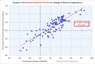 Click on graph for larger image.
The first graph shows the four quarter change in real GDP vs. the four quarter change in employment, as a percent of payroll employment (to normalize for changes in payroll over time).
The second graph shows the same relationship, but uses Gross Domestic Income instead of GDP. There is a clear relationship - the higher the change in the real GDP or real GDI, the larger the increase in payroll employment. The R2 for GDI is slightly higher than for GDP (0.80 vs. 0.74).
This shows that real GDP / real GDI has to grow at a sustained rate of about 1% just to keep the net change in payroll jobs at zero.
A 3% increase in real GDI (over a year) would lead to about a 1.4% increase in payroll employment. With approximately 130 million payroll jobs, a 1.4% increase in payroll employment would be just over 1.8 million jobs over the next year - and the unemployment rate would probably remain close to the current level (9.7%) depending on changes in population and the participation rate.
The following table summarizes several growth scenarios. The unemployment rate is from the household survey and depends on the number of people in the work force - so it cannot be calculated directly. The table uses a range of unemployment rates based on 1.6 to 2.1 million people entering the workforce over the next 12 months (a combination of population growth and discouraged workers reentering the work force).
NOTE: For those interested in understanding the differences between the household and establishment employment surveys - and why the unemployment rate cannot be calculated directly from the payroll report, see: Jobs and the Unemployment Rate
| Real Growth | Percent Payroll Growth | Annual Payroll Growth (000s) | Monthly Payroll Growth (000s) | Unemployment Rate in One Year1 |
|---|---|---|---|---|
| 6.0% | 3.6% | 4648 | 387 | 7.6% to 7.9% |
| 5.0% | 2.9% | 3718 | 310 | 8.2% to 8.5% |
| 4.0% | 2.1% | 2787 | 232 | 8.8% to 9.1% |
| 3.0% | 1.4% | 1857 | 155 | 9.4% to 9.7% |
| 2.0% | 0.7% | 926 | 77 | 10.0% to 10.3% |
| 1.0% | 0.0% | -4 | 0 | 10.6% to 10.9% |
| 1The unemployment rate is from the Household Survey and depends on several factors including changes in population and the participation rate. | ||||
I think Leamer is a little optimistic for 2010 - I'm expecting a 2nd half slowdown in GDP growth this year - and I think the unemployment rate will stay near the current level for some time.
Thursday, June 10, 2010
Weekly Initial Unemployment Claims at 456,000
by Calculated Risk on 6/10/2010 08:30:00 AM
The DOL reports on weekly unemployment insurance claims:
In the week ending June 5, the advance figure for seasonally adjusted initial claims was 456,000, a decrease of 3,000 from the previous week's revised figure of 459,000 [revised up from 453,000]. The 4-week moving average was 463,000, an increase of 2,500 from the previous week's revised average of 460,500.
...
The advance number for seasonally adjusted insured unemployment during the week ending May 29 was 4,462,000, a decrease of 255,000 from the preceding week's revised level of 4,717,000.
 Click on graph for larger image in new window.
This graph shows the 4-week moving average of weekly claims since January 2000.
The four-week average of weekly unemployment claims increased this week by 2,500 to 463,000.
The dashed line on the graph is the current 4-week average. Initial weekly claims first fell to this level in December 2009, and have been at the same level for about 6 months. The current level of 456,000 (and 4-week average of 463,000) is still high, and suggests ongoing weakness in the labor market.
Tuesday, June 08, 2010
BLS: Low Labor Turnover, Job Openings Increase in April
by Calculated Risk on 6/08/2010 10:00:00 AM
From the BLS: Job Openings and Labor Turnover Summary
There were 3.1 million job openings on the last business day of April 2010, the U.S. Bureau of Labor Statistics reported today. The job openings rate increased over the month to 2.3 percent. The hires rate (3.3 percent) and the separations rate (3.1 percent) were unchanged.Note: The difference between JOLTS hires and separations is similar to the CES (payroll survey) net jobs headline numbers. The CES (Current Employment Statistics, payroll survey) is for positions, the CPS (Current Population Survey, commonly called the household survey) is for people.
The following graph shows job openings (purple), hires (blue), Total separations (include layoffs, discharges and quits) (red) and Layoff, Discharges and other (yellow) from the JOLTS.
Unfortunately this is a new series and only started in December 2000.
 Click on graph for larger image in new window.
Notice that hires (blue) and separations (red) are pretty close each month. Right now about 4 million people lose their jobs each month, and over 4 million are hired (this is the labor turnover in the economy).
When the hires (blue line) is above total separations (as in April), the economy is adding net jobs, when the blue line is below total separations, the economy is losing net jobs.
According to the JOLTS report, there were 4.304 million hires in April (SA), and 4.000 million total separations, or 304 thousand net jobs gained. The comparable CES report showed a gain of 290 thousand jobs in April (after revision).
Note: Hires include Census 2010 temporary hires.
Layoffs and discharges have declined sharply from early 2009 - and are near a series low - and that is a good sign. And the number of job openings increased sharply in April, although the level is still pretty low.
Job openings and "layoffs and discharges" have been improving, but the overall labor turnover is still low.
Friday, June 04, 2010
Temporary Help Services starting to slow, Small Business hiring "Bleak"
by Calculated Risk on 6/04/2010 01:17:00 PM
One more graph based on data in the employment report ...
Earlier employment posts today:
Temporary Help
From the BLS report:
Temporary help services added 31,000 jobs over the month; employment in the industry has risen by 362,000 since September 2009.
 This graph is a favorite of those expecting a huge rebound in employment. The graph is a little complicated - the red line is the three month average change in temporary help services (left axis). This is shifted four months into the future.
The blue line (right axis) is the three month average change in total employment (excluding temporary help services and Census hiring).
Unfortunately the data on temporary help services only goes back to 1990, but it does appear that temporary help leads employment by about four months (although noisy).
The thinking is that before companies hire permanent employees following a recession, employers will first increase the hours worked of current employees (hours worked increased again in May) and also hire temporary employees.
Since the number of temporary workers increased sharply late last year, some people argued this was signaling the beginning of a strong employment recovery - probably in April and May. It didn't happen.
There was also evidence of a shift by employers to more temporary workers, and the joke in the comments was "We are all temporary now!". That is probably closer to the mark. The timing of this graph is useful - temporary help services does lead general employment - but the magnitude of the swings is probably less useful.
Small Business Hiring "Bleak"
The National Federation of Independent Business released the employment outlook from their May survey: Small Business Still Reluctant to Hire
“Since January 2008, the average employment per firm has been negative every month, including May 2010, which yielded a seasonally adjusted loss of negative 0.5 workers per firm. Most firms did not change employment in May, but for those that did, 8 percent increased average employment by 2.4 employees and 20 percent reduced their workforces by an average of 4 employees. Small business job creation has not crossed the 0 line in over 2 years."
...
“Overall, the job creation picture is still bleak. Poor sales and uncertainty continue to hold back any commitments to growth, hiring or capital spending. Job creation plans have been running far below comparable quarters in the recovery from two other major recessions."


