 RSS Feed
 by Calculated Risk on 1/12/2017 11:08:00 AM
Thursday, January 12, 2017
Lawler: New “Household” Numbers, Same Old Conundrum
From housing economist Tom Lawler: New “Household” Numbers, Same Old Conundrum
Housing Survey (AHS) for 2015, and the “Families and Living Arrangements” data from the Annual Social and Economic Supplement to the Current Population Survey (or CPS/ASEC) for 2016. Both surveys produce estimates (wildly different, of course) of – among other things – the number of US households and the homeownership rate.
Starting with the American Housing Survey, 2015 marked the first time since 1985 that the AHS was based on new national and metropolitan area “longitudinal” samples based on the latest available Master Address File. From 1985 through 2013 the AHS sample was mainly based on housing units selected from the 1980 Census as well as samples of housing units subsequently constructed in areas requiring building permits. Not surprisingly, the previous methodology was subject to sizable “sampling” issues. The 2015 “national’ estimates are based on (1) a “national case” sample of 34,769 representative of the US and nine divisions; (2) a 45,270 “over-sample” of top 15 metropolitan areas; (3) a 30,111 over-sample of 10 additional metropolitan areas; and (4) a 5,248 oversample of subsidized renter units.
The AHS household estimates are “controlled” to independent estimates of the US housing stock in much the same was as are the household estimates from the Housing Vacancy Survey, a supplement to the Current Population Survey. And while the AHS-based US household estimates for 2015 in aggregate aren’t massively different from that of the HVS, the characteristics of the AHS-based households for 2015 are vastly different, and are more in synch with those of the 2015 American Community Survey, as shown in the table below.
| 2015 US Household Estimates by Age Group, Various Census Surveys | |||
|---|---|---|---|
| AHS | HVS | ACS | |
| Total | 118,290 | 117,397 | 118,209 |
| 15-24 | 4,347 | 6,125 | 4,441 |
| 25-34 | 18,096 | 19,106 | 17,885 |
| 35-44 | 20,441 | 19,917 | 20,576 |
| 45-54 | 23,534 | 22,021 | 23,238 |
| 55-64 | 23,638 | 22,068 | 23,069 |
| 65-74 | 16,292 | 15,996 | 16,524 |
| 75+ | 11,942 | 12,164 | 12,476 |
What is especially striking are the rather sizable differences in the shares of US households by age group between the the HVS estimates and the ACS or AHS estimates, with the HVS estimates suggesting a much larger “young-adult’ share of total households.
Even more striking are the differences in the homeowner estimates by age group.
| 2015 US Homeowner Estimates by Age Group, Various Census Surveys | |||
|---|---|---|---|
| AHS | HVS | ACS | |
| Total | 74,360 | 74,741 | 74,506 |
| 15-24 | 501 | 1,336 | 577 |
| 25-34 | 6,485 | 7,493 | 6,582 |
| 35-44 | 11,743 | 11,645 | 11,599 |
| 45-54 | 15,968 | 15,413 | 15,853 |
| 55-64 | 17,674 | 16,645 | 17,285 |
| 65-74 | 12,917 | 12,819 | 13,160 |
| 75+ | 9,072 | 9,390 | 9,450 |
As this table indicates, the HVS estimates for young-adult homeowners are vastly higher than the AHS and ACS estimates.
Census also produces household estimates based on the CPS Annual Social and Economic Supplement (CPS./ASEC) which are not controlled to independent housing stock estimates, but instead to independent estimates of the civilian non-institutionalized population. Since (1) CPS-based surveys overstate housing vacancy rates; and (2) housing stock estimates appear to be understated, CPS/ASEC household estimates are higher than CPS/HVS estimates.
While AHS, HVS, and ACS estimates are more or less annual averages, CPS/ASEC estimates are for March, and the last two estimates for the latter are shown below.
| US Household Estimates by Age Group, Various Census Surveys | |||||
|---|---|---|---|---|---|
| AHS (2015) | HVS (2015) | ACS (2015) | CPS/ASEC (Mar 2015) | CPS/ASEC (Mar 2016) | |
| Total | 118,290 | 117,397 | 118,209 | 124,587 | 125,819 |
| 15-24 | 4,347 | 6,125 | 4,441 | 6,370 | 6,361 |
| 25-34 | 18,096 | 19,106 | 17,885 | 20,075 | 20,047 |
| 35-44 | 20,441 | 19,917 | 20,576 | 21,121 | 21,222 |
| 45-54 | 23,534 | 22,021 | 23,238 | 23,566 | 23,295 |
| 55-64 | 23,638 | 22,068 | 23,069 | 23,509 | 23,896 |
| 65-74 | 16,292 | 15,996 | 16,524 | 16,886 | 17,551 |
| 75+ | 11,942 | 12,164 | 12,476 | 13,061 | 13,448 |
Again, what is “most striking” about the numbers in this table is the substantially higher estimates of young adult householders from the CPS-based surveys relative to the other surveys.
(I’ll have much more on this topic later, including an assessment of the reliability of the household estimates from these surveys).
Weekly Initial Unemployment Claims increase to 247,000
by Calculated Risk on 1/12/2017 08:54:00 AM
The DOL reported:
In the week ending January 7, the advance figure for seasonally adjusted initial claims was 247,000, an increase of 10,000 from the previous week's revised level. The previous week's level was revised up by 2,000 from 235,000 to 237,000. The 4-week moving average was 256,500, a decrease of 1,750 from the previous week's revised average. The previous week's average was revised up by 1,500 from 256,750 to 258,250.The previous week was revised up.
There were no special factors impacting this week's initial claims. This marks 97 consecutive weeks of initial claims below 300,000, the longest streak since 1970.
emphasis added
The following graph shows the 4-week moving average of weekly claims since 1971.
 Click on graph for larger image.
The dashed line on the graph is the current 4-week average. The four-week average of weekly unemployment claims decreased to 256,500.
This was below the consensus forecast (it is difficult to seasonally adjusted during the holidays). The low level of claims suggests relatively few layoffs.
Wednesday, January 11, 2017
CNBC's Liesman: Trump's colossal error on jobs during his press conference
by Calculated Risk on 1/11/2017 07:44:00 PM
From CNBC's Steve Liesman: Donald Trump's colossal error on jobs during his press conference
Trump said that there "are 96 million wanting a job and they can't get (one). You know that story. The real number. That's the real number."This is a serious problem. Trump is at war with the data. There is a concern that Trump (and Congress) will defund the BLS and other data gathering agencies if he doesn't like what they report.
It is unfortunately very far from the real number. There are in fact 96 million Americans age 16 and older who are not in the labor force. Of this, just 5.4 million, or 91 million fewer than the number cited by Trump, say they want a job. The rest are retired, sick, disabled, running their households or going to school.
Phoenix Real Estate in December: Sales up 6%, Inventory down 3%
by Calculated Risk on 1/11/2017 02:31:00 PM
This is a key housing market to follow since Phoenix saw a large bubble and bust, followed by strong investor buying.
The Arizona Regional Multiple Listing Service (ARMLS) reports (table below):
1) Overall sales in December were up 5.9% year-over-year.
2) Cash Sales (frequently investors) were down to 23.1% of total sales.
3) Active inventory is now down 2.9% year-over-year.
More inventory (a theme in most of 2014) - and less investor buying - suggested price increases would slow sharply in 2014. And prices increases did slow in 2014, only increasing 2.4% according to Case-Shiller.
In 2015, with falling inventory, prices increased a little faster - Prices were up 6.3% in 2015 according to Case-Shiller.
This is the second consecutive month with a YoY decrease in inventory following eight months with YoY increases. This might be a change in trend - something to watch.
| December Residential Sales and Inventory, Greater Phoenix Area, ARMLS | ||||||
|---|---|---|---|---|---|---|
| Sales | YoY Change Sales | Cash Sales | Percent Cash | Active Inventory | YoY Change Inventory | |
| Dec-08 | 5,524 | --- | 1,665 | 30.1% | 53,7921 | --- |
| Dec-09 | 7,661 | 38.7% | 3,008 | 39.3% | 39,709 | -26.2%1 |
| Dec-10 | 8,401 | 9.7% | 3,939 | 46.9% | 42,463 | 6.9% |
| Dec-11 | 7,843 | -6.6% | 3,635 | 46.3% | 24,712 | -41.8% |
| Dec-12 | 7,071 | -9.8% | 3,211 | 45.4% | 21,095 | -14.6% |
| Dec-13 | 5,930 | -16.1% | 2,053 | 34.6% | 25,511 | 20.9% |
| Dec-14 | 6,475 | 9.2% | 1,893 | 29.2% | 25,052 | -1.8% |
| Dec-15 | 6,756 | 4.3% | 1,617 | 23.9% | 23,053 | -8.0% |
| Dec-16 | 7,154 | 5.9% | 1,655 | 23.1% | 22,388 | -2.9% |
| 1 December 2008 probably includes pending listings | ||||||
Question #3 for 2017: Will job creation slow further in 2017?
by Calculated Risk on 1/11/2017 10:27:00 AM
Late last year I posted some questions for 2017: Ten Economic Questions for 2017. I'll try to add some thoughts, and maybe some predictions for each question.
3) Employment: Through November1, the economy has added almost 2,000,000 jobs this year, or 180,000 per month. As expected, this was down from the 230 thousand per month in 2015. Will job creation in 2017 be as strong as in 2016? Or will job creation be even stronger, like in 2014 or 2015? Or will job creation slow further in 2017?
1Note: The December jobs report was released after I wrote this question. For 2017, the economy added 2.157 million jobs, or 180,000 per month.
For review, here is a table of the annual change in total nonfarm, private and public sector payrolls jobs since 1997. For total and private employment gains, 2014 and 2015 were the best years since the '90s, however it appears job growth peaked in 2014.
| Change in Payroll Jobs per Year (000s) | |||
|---|---|---|---|
| Total, Nonfarm | Private | Public | |
| 1997 | 3,407 | 3,212 | 195 |
| 1998 | 3,047 | 2,734 | 313 |
| 1999 | 3,179 | 2,718 | 461 |
| 2000 | 1,951 | 1,687 | 264 |
| 2001 | -1,726 | -2,277 | 551 |
| 2002 | -500 | -733 | 233 |
| 2003 | 113 | 155 | -42 |
| 2004 | 2,042 | 1,895 | 147 |
| 2005 | 2,514 | 2,328 | 186 |
| 2006 | 2,092 | 1,883 | 209 |
| 2007 | 1,147 | 859 | 288 |
| 2008 | -3,569 | -3,749 | 180 |
| 2009 | -5,070 | -4,996 | -74 |
| 2010 | 1,066 | 1,282 | -216 |
| 2011 | 2,087 | 2,399 | -312 |
| 2012 | 2,149 | 2,219 | -70 |
| 2013 | 2,311 | 2,378 | -67 |
| 2014 | 3,015 | 2,885 | 130 |
| 2015 | 2,744 | 2,651 | 93 |
| 2016 | 2,157 | 1,974 | 183 |
The good news is the economy still has solid momentum heading into the new year.
The bad news - for job growth - is that a combination of demographics and a labor market nearing full employment suggests fewer jobs will be added in 2017. Of course that should be good news for wages.
Note: Too many people compare to the '80s and '90s, without thinking about changing demographics. The prime working age population (25 to 54 years old) was growing 2.2% per year in the '80s, and 1.3% per year in the '90s. The prime working age population has actually declined slightly this decade. Note: The prime working age population is now growing slowly again, and growth will pick up the '20s.
In 2016, public employment added to total employment for the third consecutive year, but still at a fairly low level. Public hiring in 2017 will probably be similar to 2016.
The second table shows the change in construction and manufacturing payrolls starting in 2006.
| Construction Jobs (000s) | Manufacturing (000s) | |
|---|---|---|
| 2006 | 152 | -178 |
| 2007 | -195 | -269 |
| 2008 | -789 | -896 |
| 2009 | -1,047 | -1,375 |
| 2010 | -187 | 120 |
| 2011 | 144 | 207 |
| 2012 | 117 | 158 |
| 2013 | 211 | 126 |
| 2014 | 362 | 208 |
| 2015 | 296 | 26 |
| 2016 | 102 | -45 |
Energy related construction hiring declined in 2016, but will probably rebound a little in 2017 since oil prices have increased. For manufacturing, there will probably be little or no growth in the auto sector in 2017, and there will be an additional drag on manufacturing employment from the strong dollar.
So my forecast is for gains of 125,000 to 150,000 payroll jobs per month in 2017. Lower than in 2016, but another solid year for employment gains given current demographics.
Here are the Ten Economic Questions for 2017 and a few predictions:
• Question #1 for 2017: What about fiscal and regulatory policy in 2017?
• Question #2 for 2017: How much will the economy grow in 2017?
• Question #3 for 2017: Will job creation slow further in 2017?
• Question #4 for 2017: What will the unemployment rate be in December 2017?
• Question #5 for 2017: Will the core inflation rate rise in 2017? Will too much inflation be a concern in 2017?
• Question #6 for 2017: Will the Fed raise rates in 2017, and if so, by how much?
• Question #7 for 2017: How much will wages increase in 2017?
• Question #8 for 2017: How much will Residential Investment increase?
• Question #9 for 2017: What will happen with house prices in 2017?
• Question #10 for 2017: Will housing inventory increase or decrease in 2017?
MBA: Mortgage Applications Increase in Latest Weekly Survey
by Calculated Risk on 1/11/2017 07:00:00 AM
From the MBA: Mortgage Applications Increase in Latest MBA Weekly Survey
Mortgage applications increased 5.8 percent from one week earlier, according to data from the Mortgage Bankers Association’s (MBA) Weekly Mortgage Applications Survey for the week ending January 6, 2017. The most recent week’s results include an adjustment to account for the New Year’s Day holiday, while the previous week’s results were adjusted for the Christmas holiday.
... The Refinance Index increased 4 percent from the previous week. The seasonally adjusted Purchase Index increased 6 percent from one week earlier. The unadjusted Purchase Index increased 45 percent compared with the previous week and was 18 percent lower than the same week one year ago.
...
The average contract interest rate for 30-year fixed-rate mortgages with conforming loan balances ($417,000 or less) decreased to 4.32 percent from 4.39 percent, with points decreasing to 0.41 from 0.43 (including the origination fee) for 80 percent loan-to-value ratio (LTV) loans.
emphasis added
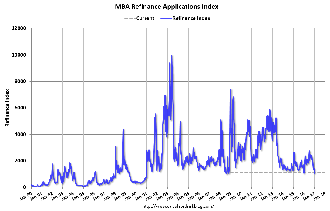 Click on graph for larger image.
The first graph shows the refinance index since 1990.
It would take a substantial increase in mortgage rates to see a significant increase in refinance activity - although we might see more cash-out refis.
 The second graph shows the MBA mortgage purchase index.
 Even with the increase in mortgage rates, purchase activity is still holding up. However refinance activity has declined significantly.
Tuesday, January 10, 2017
Thoma: "Here's what really caused the housing crisis"
by Calculated Risk on 1/10/2017 05:31:00 PM
An excellent overview from Professor Mark Thoma: Here's what really caused the housing crisis. Excerpt:
As the author of the research, Antoinette Schoar, explained in an interview:When analysts were calling it a "subprime crisis", my former co-blogger Tanta wrote "We are all subprime now!" Subprime was just the first area of stress - this was a widespread crisis.
“A lot of the narrative of the financial crisis has been that this [loan] origination process was broken, and therefore a lot of marginal and unsustainable borrowers got access to funding. In our opinion, the facts don’t line up with this narrative. … Calling this crisis a subprime crisis is a misnomer. In fact, it was a prime crisis.”
From Thoma:
As noted in a study by McClatchy from 2008, “Federal Reserve Board data show that more than 84 percent of the subprime mortgages in 2006 were issued by private lending institutions;” “private firms made nearly 83 percent of the subprime loans to low- and moderate-income borrowers that year;” and “only one of the top 25 subprime lenders in 2006 was directly subject to the housing law that’s being lambasted by conservative critics.”Those who blame the CRA or Fannie and Freddie don't understand what happened.
There were many causes to the crisis, but I believe the three keys were:
1) the change in lending practices and standards for private sector lending. As an example, the lenders used to use the three Cs: Credit, Capacity, and Collateral. At Tanta explained:
Does the borrower’s history establish creditworthiness, or the willingness to repay debt? Does the borrower’s current income and expense situation (and likely future prospects) establish the capacity or ability to repay the debt? Does the house itself, the collateral for the loan, have sufficient value and marketability to protect the lender in the event that the debt is not repaid?Instead of using the three Cs, the private lenders innovated and just used FICO scores, and then eventually little or nothing to underwrite the loan. There were other innovative changes in lending practices that didn't work out very well.
2) The rating agencies models were based on prior lending methods, and weren't adjusted sufficiently to account for the new (non-existent) underwriting standards. This meant the private label MBS was rated to highly.
3) The regulators turned a blind eye to the loose lending and excessive concentrations. I was talking with field regulators in 2005 and 2006, and they were all terrified. I was told the appointees at the top of the agencies were blocking any effort to tighten standards.
There were many causes to the crisis, and Mark Thoma does a good job of debunking a few false narratives.
Question #4 for 2017: What will the unemployment rate be in December 2017?
by Calculated Risk on 1/10/2017 02:47:00 PM
Late last year I posted some questions for 2017: Ten Economic Questions for 2017. I'll try to add some thoughts, and maybe some predictions for each question.
4) Unemployment Rate: The unemployment rate was at 4.6% in November, down 0.4 percentage points year-over-year. Currently the FOMC is forecasting the unemployment rate will be in the 4.5% to 4.6% range in Q4 2017. What will the unemployment rate be in December 2017?
Note: The unemployment rate was 4.7% in December 2016.
Forecasting the unemployment rate includes forecasts for economic and payroll growth, and also for changes in the participation rate. Note: The participation rate is the percent of the working age population (16 and over) that is in the labor force.
On participation: We can be pretty certain that the participation rate will decline over the next couple of decades based on demographic trends. However, over the last several years, the participation rate has been fairly steady as the stronger labor market offset the long term trend.
Here is a table of the participation rate and unemployment rate since 2008.
| Unemployment and Participation Rate for December each Year | |||
|---|---|---|---|
| December of | Participation Rate | Change in Participation Rate (percentage points) | Unemployment Rate |
| 2008 | 65.8% | 7.3% | |
| 2009 | 64.6% | -1.2 | 9.9% |
| 2010 | 64.3% | -0.3 | 9.3% |
| 2011 | 64.0% | -0.3 | 8.5% |
| 2012 | 63.7% | -0.3 | 7.9% |
| 2013 | 62.9% | -0.8 | 6.7% |
| 2014 | 62.7% | -0.2 | 5.6% |
| 2015 | 62.7% | 0.0 | 5.0% |
| 2016 | 62.7% | 0.0 | 4.7% |
Depending on the estimate for the participation rate and job growth (next question), it appears the unemployment rate will declining slightly by December 2017 from the current 4.7%. My guess is based on the participation rate declining slightly in 2017 - as the long term trends continue - and for decent job growth in 2017, but less than in 2016.
Here are the Ten Economic Questions for 2017 and a few predictions:
• Question #1 for 2017: What about fiscal and regulatory policy in 2017?
• Question #2 for 2017: How much will the economy grow in 2017?
• Question #3 for 2017: Will job creation slow further in 2017?
• Question #4 for 2017: What will the unemployment rate be in December 2017?
• Question #5 for 2017: Will the core inflation rate rise in 2017? Will too much inflation be a concern in 2017?
• Question #6 for 2017: Will the Fed raise rates in 2017, and if so, by how much?
• Question #7 for 2017: How much will wages increase in 2017?
• Question #8 for 2017: How much will Residential Investment increase?
• Question #9 for 2017: What will happen with house prices in 2017?
• Question #10 for 2017: Will housing inventory increase or decrease in 2017?
NFIB: Small Business Optimism Index increases in December
by Calculated Risk on 1/10/2017 12:10:00 PM
Earlier from the National Federation of Independent Business (NFIB): Small Business Optimism Skyrocketed in December
Small business optimism rocketed to its highest level since 2004, with a stratospheric 38-point jump in the number of owners who expect better business conditions, according to the monthly National Federation of Independent Business (NFIB) Index of Small Business Optimism, released today.
...
The Index reached 105.8, an increase of 7.4 points. Leading the charge was “Expect Better Business Conditions,” which shot up from a net 12 percent in November to a net 50 percent last month.
...
Despite sharply higher optimism, hiring activity remained flat in December. Job creation increased by 0.01 workers per firm and job openings dropped two points. According to the NFIB Jobs report, released last week, finding qualified workers remains a persistent problem for small business owners.
emphasis added
 Click on graph for larger image.
This graph shows the small business optimism index since 1986.
The index increased to 105.8 in December.
This is the highest level since 2004.
BLS: Job Openings "little changed" in November
by Calculated Risk on 1/10/2017 10:07:00 AM
From the BLS: Job Openings and Labor Turnover Summary
The number of job openings was little changed at 5.5 million on the last business day of November, the U.S. Bureau of Labor Statistics reported today. Over the month, hires and separations were also little changed at 5.2 million and 5.0 million, respectively.....The following graph shows job openings (yellow line), hires (dark blue), Layoff, Discharges and other (red column), and Quits (light blue column) from the JOLTS.
...
The number of quits was little changed in November at 3.1 million. The quits rate was 2.1 percent. Over the month, the number of quits was little changed for total private and for government.
emphasis added
This series started in December 2000.
Note: The difference between JOLTS hires and separations is similar to the CES (payroll survey) net jobs headline numbers. This report is for November, the most recent employment report was for December.
 Click on graph for larger image.
Note that hires (dark blue) and total separations (red and light blue columns stacked) are pretty close each month. This is a measure of labor market turnover. When the blue line is above the two stacked columns, the economy is adding net jobs - when it is below the columns, the economy is losing jobs.
Jobs openings increased in November to 5.522 million from 5.451 million in October. Job openings are mostly moving sideways at a high level.
The number of job openings (yellow) are up 6% year-over-year.
Quits are up 7% year-over-year. These are voluntary separations. (see light blue columns at bottom of graph for trend for "quits").
This is another solid report.


