 RSS Feed
 by Calculated Risk on 9/27/2016 03:25:00 PM
Tuesday, September 27, 2016
Chemical Activity Barometer indicated "Solid Growth in September"
Here is an indicator that I'm following that appears to be a leading indicator for industrial production.
From the American Chemistry Council: Chemical Activity Barometer Continues Solid Growth in September
The Chemical Activity Barometer (CAB), a leading economic indicator created by the American Chemistry Council (ACC), expanded 0.4 percent in September following a 0.4 percent gain in August and a 0.7 percent gain in July and June. Accounting for adjustments, the CAB is up 3.7 percent over this time last year, an improvement over prior months. All data is measured on a three-month moving average (3MMA). On an unadjusted basis the CAB climbed 0.2 percent in September, following a 0.4 percent gain in August.
...
Applying the CAB back to 1912, it has been shown to provide a lead of two to fourteen months, with an average lead of eight months at cycle peaks as determined by the National Bureau of Economic Research. The median lead was also eight months. At business cycle troughs, the CAB leads by one to seven months, with an average lead of four months. The median lead was three months. The CAB is rebased to the average lead (in months) of an average 100 in the base year (the year 2012 was used) of a reference time series. The latter is the Federal Reserve’s Industrial Production Index.
emphasis added
 Click on graph for larger image.
This graph shows the year-over-year change in the 3-month moving average for the Chemical Activity Barometer compared to Industrial Production. It does appear that CAB (red) generally leads Industrial Production (blue).
Currently CAB has increased solidly over the last several months, and this suggests an increase in Industrial Production over the next year.
Real Prices and Price-to-Rent Ratio in July
by Calculated Risk on 9/27/2016 12:21:00 PM
Here is the earlier post on Case-Shiller: Case-Shiller: National House Price Index increased 5.1% year-over-year in July
The year-over-year increase in prices is mostly moving sideways now around 5%. In July, the index was up 5.1% YoY.
In the earlier post, I graphed nominal house prices, but it is also important to look at prices in real terms (inflation adjusted). Case-Shiller, CoreLogic and others report nominal house prices. As an example, if a house price was $200,000 in January 2000, the price would be close to $275,000 today adjusted for inflation (37%). That is why the second graph below is important - this shows "real" prices (adjusted for inflation).
It has been almost ten years since the bubble peak. In the Case-Shiller release this morning, the National Index was reported as being 2.2% below the bubble peak (seasonally adjusted). However, in real terms, the National index is still about 16.6% below the bubble peak.
Nominal House Prices
 The first graph shows the monthly Case-Shiller National Index SA, the monthly Case-Shiller Composite 20 SA, and the CoreLogic House Price Indexes (through June) in nominal terms as reported.
In nominal terms, the Case-Shiller National index (SA) is back to December 2005 levels, and the Case-Shiller Composite 20 Index (SA) is back to June 2005 levels, and the CoreLogic index (NSA) is back to July 2005.
Real House Prices
 The second graph shows the same three indexes in real terms (adjusted for inflation using CPI less Shelter). Note: some people use other inflation measures to adjust for real prices.
CPI less Shelter has declined over the last two years pushing up real house prices.
In real terms, the National index is back to January 2004 levels, the Composite 20 index is back to October 2003, and the CoreLogic index back to November 2003.
In real terms, house prices are back to late 2003 levels.
Price-to-Rent
In October 2004, Fed economist John Krainer and researcher Chishen Wei wrote a Fed letter on price to rent ratios: House Prices and Fundamental Value. Kainer and Wei presented a price-to-rent ratio using the OFHEO house price index and the Owners' Equivalent Rent (OER) from the BLS.
 Here is a similar graph using the Case-Shiller National, Composite 20 and CoreLogic House Price Indexes.
This graph shows the price to rent ratio (January 1998 = 1.0).
On a price-to-rent basis, the Case-Shiller National index is back to July 2003 levels, the Composite 20 index is back to April 2003 levels, and the CoreLogic index is back to June 2003.
In real terms, and as a price-to-rent ratio, prices are back to late 2003 - and the price-to-rent ratio maybe moving a little more sideways now.
Richmond Fed: Regional Manufacturing Activity "Still Soft" in September
by Calculated Risk on 9/27/2016 10:16:00 AM
From the Richmond Fed: Manufacturing Sector Activity Still Soft in September; Employment Index at 36-Month Low
Manufacturing activity in the Fifth District continued to soften in September, but somewhat less so than in August, according to the Richmond Fed's latest survey. ...This was the last of the regional Fed surveys for September.
Overall manufacturing activity, as measured by the composite index, gained three points but continued to indicate some contraction, with a reading of −8 following last month’s reading of −11.
...
Hiring activity at District manufacturing firms weakened in September. The manufacturing employment indicator lost 20 points to end at a reading of −7, while the average workweek index improved from a reading of −4 in August to 1 in September. The wage index lost eight points to end at a reading of 13 for the month. ...
emphasis added
Here is a graph comparing the regional Fed surveys and the ISM manufacturing index:
 Click on graph for larger image.
The New York and Philly Fed surveys are averaged together (yellow, through September), and five Fed surveys are averaged (blue, through September) including New York, Philly, Richmond, Dallas and Kansas City. The Institute for Supply Management (ISM) PMI (red) is through August (right axis).
It seems likely the ISM manufacturing index will show expansion in September.
Case-Shiller: National House Price Index increased 5.1% year-over-year in July
by Calculated Risk on 9/27/2016 09:13:00 AM
S&P/Case-Shiller released the monthly Home Price Indices for July ("July" is a 3 month average of May, June and July prices).
This release includes prices for 20 individual cities, two composite indices (for 10 cities and 20 cities) and the monthly National index.
Note: Case-Shiller reports Not Seasonally Adjusted (NSA), I use the SA data for the graphs.
From S&P: Home Price Gains in July Slow According to the S&P CoreLogic Case-Shiller Indices
The S&P CoreLogic Case-Shiller U.S. National Home Price NSA Index, covering all nine U.S. census divisions, reported a 5.1% annual gain in July, up from 5.0% last month. The 10-City Composite posted a 4.2% annual increase, down from 4.3% the previous month. The 20-City Composite reported a year-over-year gain of 5.0%, down from 5.1% in June.
...
Before seasonal adjustment, the National Index posted a month-over-month gain of 0.7% in July. The 10-City Composite recorded a 0.5% month-over-month increase while the 20-City Composite posted a 0.6% increase in July. After seasonal adjustment, the National Index recorded a 0.4% month-overmonth increase, the 10-City Composite posted a 0.1% decrease, and the 20-City Composite remains unchanged. After seasonal adjustment, 12 cities saw prices rise, two cities were unchanged, and six cities experienced negative monthly prices changes.
emphasis added
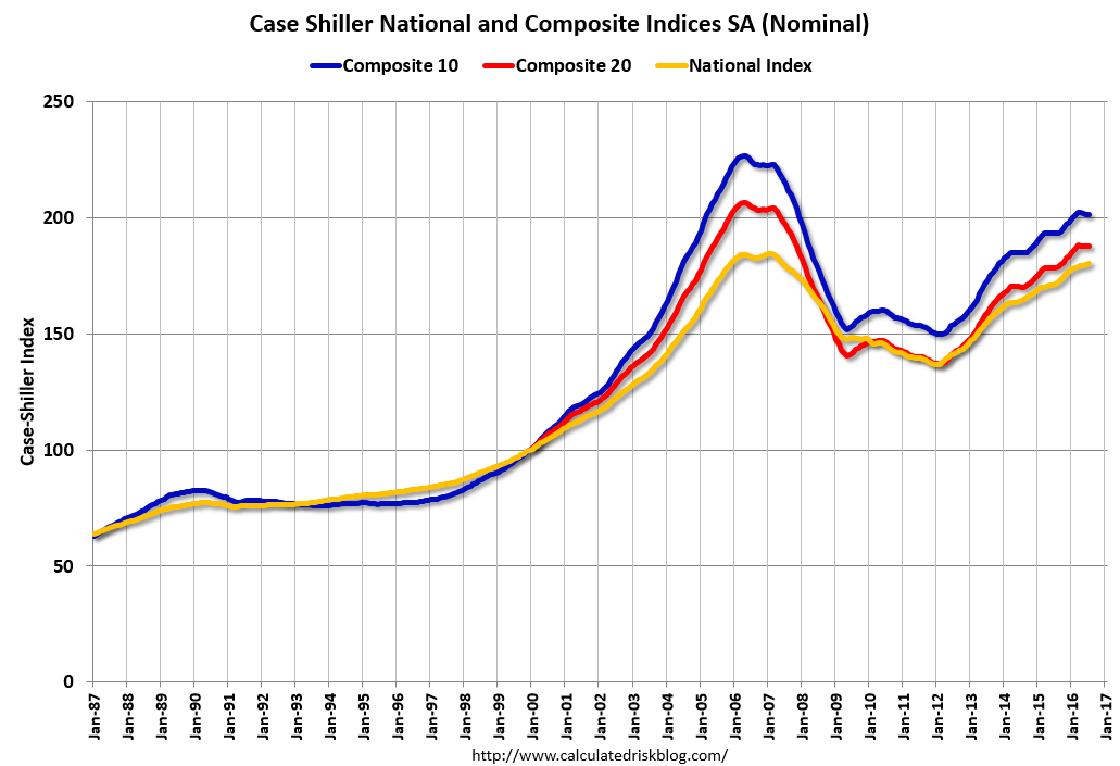 Click on graph for larger image.
 The first graph shows the nominal seasonally adjusted Composite 10, Composite 20 and National indices (the Composite 20 was started in January 2000).
The Composite 10 index is off 11.1% from the peak, and down slightly in July (SA).
The Composite 20 index is off 9.2% from the peak, and down slightly (SA) in July.
The National index is off 2.2% from the peak (SA), and up 0.4% (SA) in July. The National index is up 32.1% from the post-bubble low set in December 2011 (SA).
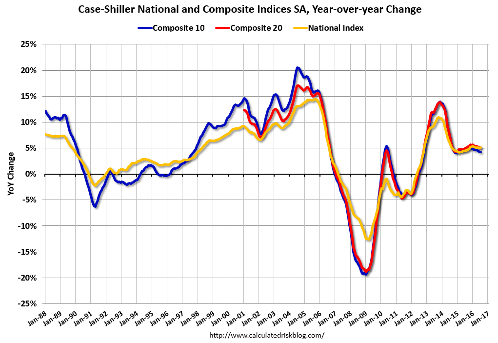 The second graph shows the Year over year change in all three indices.
The Composite 10 SA is up 4.2% compared to July 2015.
The Composite 20 SA is up 5.1% year-over-year.
The National index SA is up 5.1% year-over-year.
Note: According to the data, prices increased in 12 of 20 cities month-over-month seasonally adjusted.
I'll have more later.
Monday, September 26, 2016
Tuesday: Case-Shiller House Prices
by Calculated Risk on 9/26/2016 07:14:00 PM
Monday Night from 9:00 to 10:30 PM: the First Presidential Debate at Hofstra University in New York.
From Politifact Live fact-checking the first Trump, Clinton presidential debate
From the NY Times: How The New York Times Will Fact-Check the Debate
Tuesday:
• At 9:00 AM ET, S&P/Case-Shiller House Price Index for July. Although this is the July report, it is really a 3 month average of May, June and July prices. The consensus is for a 5.2% year-over-year increase in the Comp 20 index for July. The Zillow forecast is for the National Index to increase 5.0% year-over-year in July.
• At 10:00 AM, Richmond Fed Survey of Manufacturing Activity for September. This is the last of the regional Fed surveys for September.
Duy on the Fed: "December Looking Good. But ..."
by Calculated Risk on 9/26/2016 02:49:00 PM
From Tim Duy: December Looking Good. But ...
FOMC doves squeezed out another victory at last week’s meeting. But can they do it again in December?CR Note: A rate hike in December seems likely right now.
As was widely expected, the Fed held rates steady at the September FOMC meeting. That said, the meeting was clearly divisive, with three dissents, all from regional bank presidents. And the accompanying statement leaned in a hawkish direction – the committee noted that near-term risks were “balanced” and that the case for a rate hike had “strengthened.” Moreover, only three of the participants did not expect a rate hike before year end.
And if that was not enough, during her press conference, Federal Reserve Chair Janet Yellen suggested the bar to a December rate hike was low:
... most participants do expect that one increase in the federal funds rate will be appropriate this year and I would expect to see that if we continue on the current course of labor market improvement and there are no major new risks that develop and we simply stay on the current course.Sounds like December is a go. But markets are not entirely convinced, with participants pricing in a roughly 60% chance of a rate hike. Perhaps this pricing reflects post-election economic risk. Or perhaps it reflects the possibility that the doves can stare down the hawks one more time before the composition of the Board changes next year.
...
Bottom Line: Doves on the Board continue to delay the preemptive strike on inflation. Stalling gains on unemployment and underemployment gave them the ammunition to stand their ground. If those gains resume, doves will fall prey to the hawks at the next meeting. But they will have an easier time maintaining a shallow path of policy next year, and hopefully are better set to communicate that path.
A few Comments on August New Home Sales
by Calculated Risk on 9/26/2016 11:23:00 AM
The new home sales report for August was strong at 609,000 on a seasonally adjusted annual rate basis (SAAR) - the highest for the month of August since 2007 - and the second highest sales rate since January 2008 (only last month was higher). However combined sales for May, June and July were revised down slightly.
Sales were up 20.6% year-over-year (YoY) compared to August 2015. And sales are up 13.3% year-to-date compared to the same period in 2015.
This is very solid year-over-year growth. And new home sales are much more important for jobs and the economy than existing home sales. Since existing sales are existing stock, the only direct contribution to GDP is the broker's commission. There is usually some additional spending with an existing home purchase - new furniture, etc - but overall the economic impact is small compared to a new home sale.
Earlier: New Home Sales decreased to 609,000 Annual Rate in August.
 Click on graph for larger image.
This graph shows new home sales for 2015 and 2016 by month (Seasonally Adjusted Annual Rate). Sales to date are up 13.3% year-over-year, because of very strong year-over-year growth over the last five months.
Overall I expected lower growth this year, in the 4% to 8% range. Slower growth seemed likely this year because Houston (and other oil producing areas) will have a problem this year. It looks like I was too pessimistic on new home sales this year.
And here is another update to the "distressing gap" graph that I first started posting a number of years ago to show the emerging gap caused by distressed sales. Now I'm looking for the gap to close over the next several years.
 The "distressing gap" graph shows existing home sales (left axis) and new home sales (right axis) through August 2016. This graph starts in 1994, but the relationship had been fairly steady back to the '60s.
Following the housing bubble and bust, the "distressing gap" appeared mostly because of distressed sales.
I expect existing home sales to move more sideways, and I expect this gap to slowly close, mostly from an increase in new home sales.
However, this assumes that the builders will offer some smaller, less expensive homes. If not, then the gap will persist.
 Another way to look at this is a ratio of existing to new home sales.
This ratio was fairly stable from 1994 through 2006, and then the flood of distressed sales kept the number of existing home sales elevated and depressed new home sales. (Note: This ratio was fairly stable back to the early '70s, but I only have annual data for the earlier years).
In general the ratio has been trending down, and this ratio will probably continue to trend down over the next several years.
Note: Existing home sales are counted when transactions are closed, and new home sales are counted when contracts are signed. So the timing of sales is different.
New Home Sales decreased to 609,000 Annual Rate in August
by Calculated Risk on 9/26/2016 10:13:00 AM
The Census Bureau reports New Home Sales in August were at a seasonally adjusted annual rate (SAAR) of 609 thousand.
The previous three months were revised down by a total of 4 thousand (SAAR).
"Sales of new single-family houses in August 2016 were at a seasonally adjusted annual rate of 609,000, according to estimates released jointly today by the U.S. Census Bureau and the Department of Housing and Urban Development. This is 7.6 percent below the revised July rate of 659,000, but is 20.6 percent above the August 2015 estimate of 505,000."
emphasis added
 Click on graph for larger image.
The first graph shows New Home Sales vs. recessions since 1963. The dashed line is the current sales rate.
Even with the increase in sales since the bottom, new home sales are still fairly low historically.
The second graph shows New Home Months of Supply.
 The months of supply increased in August to 4.6 months.
 The all time record was 12.1 months of supply in January 2009.
This is now in the normal range (less than 6 months supply is normal).
"The seasonally adjusted estimate of new houses for sale at the end of August was 235,000. This represents a supply of 4.6 months at the current sales rate."
 On inventory, according to the Census Bureau:
 "A house is considered for sale when a permit to build has been issued in permit-issuing places or work has begun on the footings or foundation in nonpermit areas and a sales contract has not been signed nor a deposit accepted."Starting in 1973 the Census Bureau broke this down into three categories: Not Started, Under Construction, and Completed.
The third graph shows the three categories of inventory starting in 1973.
The inventory of completed homes for sale is still low, and the combined total of completed and under construction is also low.
 The last graph shows sales NSA (monthly sales, not seasonally adjusted annual rate).
In August 2016 (red column), 50 thousand new homes were sold (NSA). Last year 41 thousand homes were sold in August.
The all time high for August was 110 thousand in 2005, and the all time low for August was 23 thousand in August 2010.
This was above expectations of 598,000 sales SAAR in August. A solid report. I'll have more later today.
Black Knight: House Price Index up 0.4% in July, Up 5.3% year-over-year
by Calculated Risk on 9/26/2016 08:12:00 AM
Note: I follow several house price indexes (Case-Shiller, CoreLogic, Black Knight, Zillow, FHFA, FNC and more). Note: Black Knight uses the current month closings only (not a three month average like Case-Shiller or a weighted average like CoreLogic), excludes short sales and REOs, and is not seasonally adjusted.
From Black Knight: Black Knight Home Price Index Report: July 2016 Transactions, U.S. Home Prices Up 0.4 Percent for the Month; Up 5.3 Percent Year-Over-Year
• U.S. home prices were up 0.4 percent for the month, and have gained 5.3 percent from one year agoThe year-over-year increase in this index has been about the same for the last year.
• At $266K, the U.S. HPI has risen over 33 percent from the market’s bottom and is now within just 0.8 percent of a new national peak
• Home prices in nine of the nation’s 20 largest states and 14 of the 40 largest metros hit new peaks in July
Note that house prices are close to the bubble peak in nominal terms, but not adjusted for inflation.
Sunday, September 25, 2016
Monday: New Home Sales, Presidential Debate
by Calculated Risk on 9/25/2016 07:44:00 PM
I mentioned this on twitter earlier today:
I spoke to a local infill spec builder yesterday who has been asking me for advice for several years (and happy with my advice!). The builder brought up the election ... The spec builder told me he was thinking of voting for Trump because his tax rate would be lower. I asked him "How is business?"
The spec builder told me 2016 was his best year ever, and the last few years have been the best of his career.
So I asked what he thought would happen if Trump was elected?
We discussed The Wall, more deportations, trade disputes and more. He asked for my advice if Trump is elected: I explained that it is not possible to predict exactly what will happen because Trump's proposals all over the place ... and Congress would probably block some of Trump’s proposals.
But in general, my advice would be to scale back on his spec building.
I also told him that all key forecasters are assuming Ms. Clinton will win, so forecasts will be revised (probably down) ... And if Trump is elected, the changing forecasts would mean the markets will be volatile. He noted that his sales always slow when the markets are volatile.
My conclusion was that voting for a lower tax rate – and probably worse business conditions – seems penny-wise and pound foolish.
Weekend:
• Schedule for Week of Sept 25, 2016
Monday:
• At 10:00 AM ET, New Home Sales for August from the Census Bureau. The consensus is for an decrease in sales to 598 thousand Seasonally Adjusted Annual Rate (SAAR) in August from 654 thousand in July.
• At 10:00 AM, Dallas Fed Survey of Manufacturing Activity for September.
• From 9:00 to 10:30 PM ET: the First Presidential Debate at Hofstra University in New York.
From CNBC: Pre-Market Data and Bloomberg futures: S&P futures are up 1 and DOW futures are up 20 (fair value).
Oil prices were up over the last week with WTI futures at $44.85 per barrel and Brent at $46.26 per barrel. A year ago, WTI was at $45, and Brent was at $47 - so prices are down slightly year-over-year.
Here is a graph from Gasbuddy.com for nationwide gasoline prices. Nationally prices are at $2.20 per gallon (down less than $0.10 per gallon from a year ago).


