by Calculated Risk on 9/02/2016 03:59:00 PM
Friday, September 02, 2016
Public and Private Sector Payroll Jobs: Carter, Reagan, Bush, Clinton, Bush, Obama
By request, here is another update of an earlier post through the August 2016 employment report including all revisions.
NOTE: Several readers have asked if I could add a lag to these graphs (obviously a new President has zero impact on employment for the month they are elected). But that would open a debate on the proper length of the lag, so I'll just stick to the beginning of each term.
Note: We frequently use Presidential terms as time markers - we could use Speaker of the House, or any other marker.
Important: There are many differences between these periods. Overall employment was smaller in the '80s, however the participation rate was increasing in the '80s (younger population and women joining the labor force), and the participation rate is generally declining now. But these graphs give an overview of employment changes.
First, here is a table for private sector jobs. The top two private sector terms were both under President Clinton. Reagan's 2nd term saw about the same job growth as during Carter's term. Note: There was a severe recession at the beginning of Reagan's first term (when Volcker raised rates to slow inflation) and a recession near the end of Carter's term (gas prices increased sharply and there was an oil embargo).
| Term | Private Sector Jobs Added (000s) |
|---|---|
| Carter | 9,041 |
| Reagan 1 | 5,360 |
| Reagan 2 | 9,357 |
| GHW Bush | 1,510 |
| Clinton 1 | 10,884 |
| Clinton 2 | 10,082 |
| GW Bush 1 | -811 |
| GW Bush 2 | 415 |
| Obama 1 | 1,921 |
| Obama 2 | 8,9901 |
| 143 months into 2nd term: 10,035 pace. | |
The first graph shows the change in private sector payroll jobs from when each president took office until the end of their term(s). Presidents Carter and George H.W. Bush only served one term, and President Obama is in the final months of his second term.
Mr. G.W. Bush (red) took office following the bursting of the stock market bubble, and left during the bursting of the housing bubble. Mr. Obama (blue) took office during the financial crisis and great recession. There was also a significant recession in the early '80s right after Mr. Reagan (yellow) took office.
There was a recession towards the end of President G.H.W. Bush (purple) term, and Mr Clinton (light blue) served for eight years without a recession.
 Click on graph for larger image.
The first graph is for private employment only.
The employment recovery during Mr. G.W. Bush's (red) first term was sluggish, and private employment was down 811,000 jobs at the end of his first term. At the end of Mr. Bush's second term, private employment was collapsing, and there were net 396,000 private sector jobs lost during Mr. Bush's two terms.
Private sector employment increased slightly under President G.H.W. Bush (purple), with 1,510,000 private sector jobs added.
Private sector employment increased by 20,966,000 under President Clinton (light blue), by 14,717,000 under President Reagan (yellow), and 9,041,000 under President Carter (dashed green).
There were only 1,921,000 more private sector jobs at the end of Mr. Obama's first term. Forty three months into Mr. Obama's second term, there are now 10,911,000 more private sector jobs than when he initially took office.
 A big difference between the presidencies has been public sector employment. Note the bumps in public sector employment due to the decennial Census in 1980, 1990, 2000, and 2010.
 The public sector grew during Mr. Carter's term (up 1,304,000), during Mr. Reagan's terms (up 1,414,000), during Mr. G.H.W. Bush's term (up 1,127,000), during Mr. Clinton's terms (up 1,934,000), and during Mr. G.W. Bush's terms (up 1,744,000 jobs).
However the public sector has declined significantly since Mr. Obama took office (down 366,000 jobs). This has been a significant drag on overall employment.
And a table for public sector jobs. Public sector jobs declined the most during Obama's first term, and increased the most during Reagan's 2nd term.
| Term | Public Sector Jobs Added (000s) |
|---|---|
| Carter | 1,304 |
| Reagan 1 | -24 |
| Reagan 2 | 1,438 |
| GHW Bush | 1,127 |
| Clinton 1 | 692 |
| Clinton 2 | 1,242 |
| GW Bush 1 | 900 |
| GW Bush 2 | 844 |
| Obama 1 | -708 |
| Obama 2 | 3421 |
| 143 months into 2nd term, 382 pace | |
Looking forward, I expect the economy to continue to expand through 2016 (at least), so I don't expect a sharp decline in private employment as happened at the end of Mr. Bush's 2nd term (In 2005 and 2006 I was warning of a coming down turn due to the bursting of the housing bubble - and I predicted a recession in 2007).
For the public sector, the cutbacks are clearly over. Right now I'm expecting some further increase in public employment during the remainder of Obama's 2nd term, but nothing like what happened during Reagan's second term.
Below is a table of the top four presidential terms for private job creation (they also happen to be the four best terms for total non-farm job creation).
Clinton's two terms were the best for both private and total non-farm job creation, followed by Reagan's 2nd term.
Currently Obama's 2nd term is on pace to be the 3rd best ever for private job creation. However, with very few public sector jobs added, Obama's 2nd term is only on pace to be the fourth best for total job creation.
Note: Only 342 thousand public sector jobs have been added during the first forty three months of Obama's 2nd term (following a record loss of 708 thousand public sector jobs during Obama's 1st term). This is about 25% of the public sector jobs added during Reagan's 2nd term!
| Top Employment Gains per Presidential Terms (000s) | ||||
|---|---|---|---|---|
| Rank | Term | Private | Public | Total Non-Farm |
| 1 | Clinton 1 | 10,884 | 692 | 11,576 |
| 2 | Clinton 2 | 10,082 | 1,242 | 11,312 |
| 3 | Reagan 2 | 9,357 | 1,438 | 10,795 |
| 4 | Carter | 9,041 | 1,304 | 10,345 |
| Obama 21 | 8,990 | 342 | 9,332 | |
| Pace2 | 10,035 | 382 | 10,417 | |
| 143 Months into 2nd Term 2Current Pace for Obama's 2nd Term | ||||
The last table shows the jobs needed per month for Obama's 2nd term to be in the top four presidential terms. Right now it looks like Obama's 2nd term will be 2nd or 3rd for private employment, and either 4th or 5th for total employment.
| Average Jobs needed per month (000s) for remainder of Obama's 2nd Term | ||||
|---|---|---|---|---|
| to Rank | Private | Total | ||
| #1 | 379 | 449 | ||
| #2 | 218 | 398 | ||
| #3 | 73 | 293 | ||
| #4 | 10 | 203 | ||
Trade Deficit at $39.5 Billion in July
by Calculated Risk on 9/02/2016 12:51:00 PM
Earlier from the Department of Commerce reported:
The U.S. Census Bureau and the U.S. Bureau of Economic Analysis, through the Department of Commerce, announced today that the goods and services deficit was $39.5 billion in July, down $5.2 billion from $44.7 billion in June, revised. July exports were $186.3 billion, $3.4 billion more than June exports. July imports were $225.8 billion, $1.8 billion less than June imports.The trade deficit was smaller than the consensus forecast of $41.3 billion.
The first graph shows the monthly U.S. exports and imports in dollars through July 2016.
 Click on graph for larger image.
Imports decreased and exports increased in July.
Exports are 13% above the pre-recession peak and down 2% compared to July 2015; imports are also down 2% compared to July 2015.
It appears trade might be picking up a little.
The second graph shows the U.S. trade deficit, with and without petroleum.
 The blue line is the total deficit, and the black line is the petroleum deficit, and the red line is the trade deficit ex-petroleum products.
Oil imports averaged $41.02 in July, up from $39.38 in June, and down from $54.20 in July 2015. The petroleum deficit has generally been declining and is the major reason the overall deficit has declined a little since early 2012.
The trade deficit with China decreased to $30.3 billion in July, from $31.7 billion in July 2015. The deficit with China is a substantial portion of the overall deficit.
Employment Comments: A Decent Report
by Calculated Risk on 9/02/2016 09:55:00 AM
The headline jobs number was decent. Job growth averaged 232,000 over the last three months, and both the participation rate and employment-population ratio were unchanged. Wages increased slightly.
Earlier: August Employment Report: 151,000 Jobs, 4.9% Unemployment Rate
In August, the year-over-year change was 2.45 million jobs - a solid gain.
Average Hourly Earnings
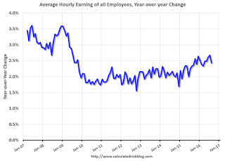
The graph shows the nominal year-over-year change in "Average Hourly Earnings" for all private employees. Nominal wage growth was at 2.4% YoY in August. This series is noisy, however overall wage growth is trending up.
Note: CPI has been running around 2%, so there has been real wage growth.
Employment-Population Ratio, 25 to 54 years old
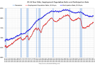
In the earlier period the participation rate for this group was trending up as women joined the labor force. Since the early '90s, the participation rate moved more sideways, with a downward drift starting around '00 - and with ups and downs related to the business cycle.
The 25 to 54 participation rate increased in August to 81.3%, and the 25 to 54 employment population ratio decreased to 77.7%.
The participation rate for this group might increase a little more (or at least stabilize for a couple of years) - although the participation rate has been trending down for this group since the late '90s.
Part Time for Economic Reasons
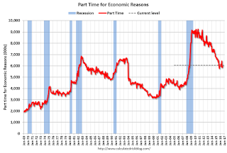
The number of persons employed part time for economic reasons (sometimes referred to as involuntary part-time workers) was little changed at 6.1 million in August. These individuals, who would have preferred full-time employment, were working part time because their hours had been cut back or because they were unable to find a full-time job.The number of persons working part time for economic reasons increased slightly in August. This level suggests slack still in the labor market.
These workers are included in the alternate measure of labor underutilization (U-6) that was unchanged at 9.7% in August.
Unemployed over 26 Weeks
 This graph shows the number of workers unemployed for 27 weeks or more.
 According to the BLS, there are 2.006 million workers who have been unemployed for more than 26 weeks and still want a job. This was down slightly from 2.020 million in July.
This is generally trending down, but is still high.
There are still signs of slack (as example, elevated level of part time workers for economic reasons and U-6), but there also signs the labor market is tightening.
Overall this was a decent report. Job growth averaged 232,000 over the last three months, and 182,000 per month this year.
August Employment Report: 151,000 Jobs, 4.9% Unemployment Rate
by Calculated Risk on 9/02/2016 08:30:00 AM
From the BLS:
Total nonfarm payroll employment increased by 151,000 in August, and the unemployment rate remained at 4.9 percent, the U.S. Bureau of Labor Statistics reported today. Employment continued to trend up in several service-providing industries.
...
The change in total nonfarm payroll employment for June was revised down from +292,000 to +271,000, and the change for July was revised up from +255,000 to +275,000. With these revisions, employment gains in June and July combined were 1,000 less than previously reported.
...
In August, average hourly earnings for all employees on private nonfarm payrolls rose by 3 cents to $25.73. Over the year, average hourly earnings have risen by 2.4 percent.
emphasis added
 Click on graph for larger image.
The first graph shows the monthly change in payroll jobs, ex-Census (meaning the impact of the decennial Census temporary hires and layoffs is removed - mostly in 2010 - to show the underlying payroll changes).
Total payrolls increased by 151 thousand in August (private payrolls increased 126 thousand).
Payrolls for June and July were revised down by a combined 1 thousand.
 This graph shows the year-over-year change in total non-farm employment since 1968.
In August, the year-over-year change was 2.45 million jobs. A solid gain.
The third graph shows the employment population ratio and the participation rate.
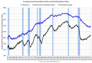 The Labor Force Participation Rate was unchanged in August at 62.8%. This is the percentage of the working age population in the labor force. A large portion of the recent decline in the participation rate is due to demographics.
 The Employment-Population ratio was unchanged at 59.7% (black line).
I'll post the 25 to 54 age group employment-population ratio graph later.
 The fourth graph shows the unemployment rate.
 The unemployment rate was unchanged in August at 4.9%.
This was below expectations of 175,000 jobs. Still a decent report.
I'll have much more later ...
Thursday, September 01, 2016
Friday: Jobs, Trade Deficit
by Calculated Risk on 9/01/2016 07:01:00 PM
Friday:
• At 8:30 AM ET, Employment Report for August. The consensus is for an increase of 175,000 non-farm payroll jobs added in August, down from the 255,000 non-farm payroll jobs added in July. The consensus is for the unemployment rate to decrease to 4.8%.
• Also at 8:30 AM, Trade Balance report for July from the Census Bureau. The consensus is for the U.S. trade deficit to be at $41.3 billion in July from $44.5 billion in June.
• At 10:00 AM, Manufacturers' Shipments, Inventories and Orders (Factory Orders) for July. The consensus is a 2.0% increase in orders.
From Tim Duy at Fed Watch: Thoughts Ahead Of The Employment Report
The August employment report has come to be seen as the deciding factor in the Fed's upcoming decision on rates. See Sam Fleming at the Financial Times here. Maybe this is the case, maybe not. I hope not. Hinging policy on the first print of nonfarm payrolls - a volatile, heavily revised number - would be pretty low quality policy making.
...
Bottom Line: Regardless of the outcome of the employment report, good or bad, I don't see good case for moving this month. Too many questions about the forecast, and they still face persistently low inflation and asymmetric policy risks. But all that said, there seems to be a large swath of voting members ready to get behind a rate hike. I think the low odds on a rate hike in September is the market's way of telling the Fed that if they do hike, it would be a mistake.
Goldman's August NFP Preview
by Calculated Risk on 9/01/2016 05:37:00 PM
A few excerpts from Goldman Sachs' August Payroll Preview by economist Elad Pashtan:
We expect a 165k increase in nonfarm payroll employment in August, below consensus expectations for a 180k gain. ...
The unemployment rate is likely to decline to 4.8%, while average hourly earnings were likely flat in August and up 2.3% over the past year.
...
Our below-consensus forecast primarily reflects seasonal quirks specific to the August payroll period. Since 2011, August payroll growth has fallen short of Bloomberg consensus expectations by an average of 49k, only to be revised up by an average of 71k in subsequent releases. Industry-level payroll data indicate that the education sector (specifically, education services and state & local government employment, the latter largely reflecting public schools) accounts for much of the upward revision, which mostly occurs from the first to the second estimate of payroll growth. In our view, the initial August weakness and subsequent revisions reflects seasonal adjustment challenges related to shifts in the timing of school calendars. Since this pattern failed to hold last year, we are estimating a more conservative 20k impact this year.
emphasis added
U.S. Light Vehicle Sales decrease to 16.9 million annual rate in August
by Calculated Risk on 9/01/2016 03:09:00 PM
Based on a preliminary estimate from WardsAuto (ex-Porsche), light vehicle sales were at a 16.89 million SAAR in August.
That is down about 5% from August 2015, and down 5.0% from the 17.77 million annual sales rate last month.
Click on graph for larger image.
This graph shows the historical light vehicle sales from the BEA (blue) and an estimate for August (red, light vehicle sales of 16.89 million SAAR from WardsAuto).
This was below the consensus forecast of 17.1 million SAAR (seasonally adjusted annual rate).
The second graph shows light vehicle sales since the BEA started keeping data in 1967.

Sales for 2016 - through the first eight months - are up slightly from the comparable period last year.
After increasing significantly for several years following the financial crisis, auto sales are now moving mostly sideways ...
Construction Spending unchanged in July
by Calculated Risk on 9/01/2016 11:59:00 AM
Earlier today, the Census Bureau reported that overall construction spending was "nearly the same" as in June:
The U.S. Census Bureau of the Department of Commerce announced today that construction spending during July 2016 was estimated at a seasonally adjusted annual rate of $1,153.2 billion, nearly the same as the revised June estimate of $1,153.5 billion. The July figure is 1.5 percent above the July 2015 estimate of $1,135.9 billion.Private spending increased and public spending decreased in July:
Spending on private construction was at a seasonally adjusted annual rate of $875.0 billion, 1.0 percent above the revised June estimate of $866.5 billion. ...
In July, the estimated seasonally adjusted annual rate of public construction spending was $278.2 billion, 3.1 percent below the revised June estimate of $287.0 billion.
emphasis added
 Click on graph for larger image.
This graph shows private residential and nonresidential construction spending, and public spending, since 1993. Note: nominal dollars, not inflation adjusted.
Residential and public spending have slumped a little recently.
Private residential spending has been generally increasing, but is 34% below the bubble peak.
Non-residential spending is now 3.6% the peak in January 2008 (nominal dollars).
Public construction spending is now 15% below the peak in March 2009.
 The second graph shows the year-over-year change in construction spending.
On a year-over-year basis, private residential construction spending is up 2%. Non-residential spending is up 7% year-over-year. Public spending is down 7% year-over-year.
Looking forward, all categories of construction spending should increase in 2016. Residential spending is still fairly low, non-residential is increasing, and public spending is also generally increasing after several years of austerity.
This was well below the consensus forecast of a 0.6% increase for July, however construction spending for the previous two months were revised up.
ISM Manufacturing index decreased to 49.4 in August
by Calculated Risk on 9/01/2016 10:11:00 AM
The ISM manufacturing index indicated contraction in August. The PMI was at 49.4% in August, down from 52.6% in July. The employment index was at 48.3%, down from 49.4% in July, and the new orders index was at 49.1%, down from 56.9% in July.
From the Institute for Supply Management: August 2016 Manufacturing ISM® Report On Business®
Economic activity in the manufacturing sector contracted in August following five consecutive months of expansion, while the overall economy grew for the 87th consecutive month, say the nation's supply executives in the latest Manufacturing ISM® Report On Business®.
The report was issued today by Bradley J. Holcomb, CPSM, CPSD, chair of the Institute for Supply Management® (ISM®) Manufacturing Business Survey Committee. "The August PMI® registered 49.4 percent, a decrease of 3.2 percentage points from the July reading of 52.6 percent. The New Orders Index registered 49.1 percent, a decrease of 7.8 percentage points from the July reading of 56.9 percent. The Production Index registered 49.6 percent, 5.8 percentage points lower than the July reading of 55.4 percent. The Employment Index registered 48.3 percent, a decrease of 1.1 percentage points from the July reading of 49.4 percent. Inventories of raw materials registered 49 percent, a decrease of 0.5 percentage point from the July reading of 49.5 percent. The Prices Index registered 53 percent, a decrease of 2 percentage points from the July reading of 55 percent, indicating higher raw materials prices for the sixth consecutive month. Manufacturing contracted in August for the first time since February of this year, as only six of our 18 industries reported an increase in new orders in August (down from 12 in July), and only eight of our 18 industries reported an increase in production in August (down from nine in July)."
emphasis added
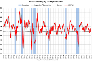 Click on graph for larger image.
Here is a long term graph of the ISM manufacturing index.
This was below expectations of 52.2%, and suggests manufacturing contracted in August following five months of expansion.
Weekly Initial Unemployment Claims increased to 263,000
by Calculated Risk on 9/01/2016 08:33:00 AM
The DOL reported:
In the week ending August 27, the advance figure for seasonally adjusted initial claims was 263,000, an increase of 2,000 from the previous week's unrevised level of 261,000. The 4-week moving average was 263,000, a decrease of 1,000 from the previous week's unrevised average of 264,000.The previous week was unrevised.
There were no special factors impacting this week's initial claims. This marks 78 consecutive weeks of initial claims below 300,000, the longest streak since 1970.
The following graph shows the 4-week moving average of weekly claims since 1971.
 Click on graph for larger image.
The dashed line on the graph is the current 4-week average. The four-week average of weekly unemployment claims decreased to 263,000.
This was lower than the consensus forecast of 265,000. The low level of claims suggests relatively few layoffs.


