by Calculated Risk on 3/03/2013 10:34:00 AM
Sunday, March 03, 2013
Housing: The Two Bottoms
Last year when I wrote The Housing Bottom is Here and Housing: The Two Bottoms, I pointed out there are usually two bottoms for housing: the first for new home sales, housing starts and residential investment, and the second bottom is for house prices.
For the bottom in activity, I presented a graph of Single family housing starts, New Home Sales, and Residential Investment (RI) as a percent of GDP.
When I posted that graph, the bottom wasn't obvious to everyone. Now it is, and here is another update to that graph.
 Click on graph for larger image.
The arrows point to some of the earlier peaks and troughs for these three measures.
The purpose of this graph is to show that these three indicators generally reach peaks and troughs together. Note that Residential Investment is quarterly and single-family starts and new home sales are monthly.
For the current housing bust, the bottom was spread over a few years from 2009 into 2011. This was a long flat bottom - something a number of us predicted given the overhang of existing vacant housing units.
We could use any of these three measures to determine the first bottom, and then use the other two to confirm the bottom. But this says nothing about prices.
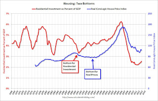 The second graph compares RI as a percent of GDP with the real (adjusted for inflation) CoreLogic house price index through December.
Although the CoreLogic data only goes back to 1976, look at what happened following the early '90s housing bust. RI as a percent of GDP bottomed in Q1 1991, but real house prices didn't bottom until Q4 1996 (real prices were mostly flat for several year). Something similar happened in the early 1980s - first activity bottomed, and then real prices - although the two bottoms were closer in the '80s.
Now it appears activity bottomed in 2009 through 2011 (depending on the measure) and house prices bottomed in early 2012.
Saturday, March 02, 2013
Unofficial Problem Bank list declines to 808 Institutions
by Calculated Risk on 3/02/2013 04:11:00 PM
Here is the unofficial problem bank list for Mar 1, 2013.
Changes and comments from surferdude808:
There was only one removal this week to the Unofficial Problem Bank List. After removal, the list holds 808 institutions with assets of $298.1 billion. From last week, assets fell by $4.7 billion with $4.0 billion of the decline in assets during the fourth quarter. A year ago, the list held 959 institutions with assets of $385.4 billion. According to an SEC filing, the FDIC terminated the action against Bank of Granite, Charlotte, NC ($717 million Ticker: FNBN).Earlier:
This week the FDIC issued industry results for the fourth quarter including an update on the Official Problem Bank List. While the FDIC does not disclose institutions on the official list, they provided an institution count of 651 with assets of $233 billion. During the quarter, the official list declined by 43 institutions and assets dropped $29 billion. Since the last FDIC release, the unofficial list declined by 66 institutions and assets dropped $36.9 billion. After the FDIC released problem bank figures for the second quarter of 2010, the unofficial list has been higher since while it was lower at the time of prior quarterly releases. The upside tracking difference peaked at 185 institutions and assets of $72.6 billion when second quarter of 2012 figures were released. With the current release, the differences have been reduced to 157 institutions and assets of $65.0 billion.
Because the FDIC does not publish the official list, a proxy or unofficial list can be developed by reviewing press releases and published formal enforcement actions issued by the three federal banking regulators, reviewing SEC filings, or through media reports and company announcements describing that the bank is under a formal enforcement action. For the most part, the official problem bank list is comprised of banks with a safety & soundness CAMELS composite rating of 4 or 5 (the banking regulators use the FFIEC rating system known as CAMELS, which stands for the components that receive a rating including Capital adequacy, Asset quality, Management quality, Earnings strength, Liquidity strength, and Sensitivity to market risk. A composite rating is assigned from the components, but it does not result from a simple average of the components. The composite and component rating scale is from 1 to 5, with 1 being the strongest). Customarily, a banking regulator will only issue a safety & soundness formal enforcement when a bank has a composite CAMELS rating of 4 or 5, which reflects an unsafe & unsound financial condition that if not corrected could result in failure. There is high positive correlation between banks with a safety & soundness composite rating of 4 or worse and those listed on the official list. For example, many safety & soundness enforcement actions state in their preamble that an unsafe & sound condition exists, which is the reason for action issuance.
Since 1991, the banking regulators have statutorily been required to publish formal enforcement actions. For many reasons, the banking regulators have a general discomfort publishing any information on open banks especially formal enforcement actions, so not much energy is expended on their part ensuring the completeness of information in the public domain or making its retrieval simple. Given the difficulty for easy retrieval of all banks operating under a safety & soundness formal enforcement action, the unofficial list fills this void as a matter of public interest.
All of the banks on the unofficial list have received a safety & soundness formal enforcement action by a federal banking regulator or there is other information in the public domain such as an SEC filing, media release, or company statement that describe the bank being issued such an action. No confidential or non-public information supports any bank listed and a hypertext link to the public information is provided in the spreadsheet listing. The publishers make every effort to ensure the accuracy of the unofficial list and welcome all feedback and any credible information to support removal of any bank listed erroneously.
• Summary for Week Ending March 1st
• Schedule for Week of March 3rd
Schedule for Week of March 3rd
by Calculated Risk on 3/02/2013 01:11:00 PM
Earlier:
• Summary for Week Ending March 1st
The key report this week is the February employment report on Friday.
Other key reports include the ISM service index on Tuesday, and the Trade Balance report on Thursday.
Also, the Federal Reserve will release the Q4 Flow of Funds report on Thursday.
8:00 AM ET: Speech by Fed Vice Chair Janet Yellen, "Challenges Confronting Monetary Policy", At the 29th National Association for Business Economics Policy Conference, Washington, D.C.
10:00 AM: ISM non-Manufacturing Index for February. The consensus is for a decrease to 55.0 from 55.2 in January. Note: Above 50 indicates expansion, below 50 contraction.
10:00 AM: Trulia Price Rent Monitors for February. This is the index from Trulia that uses asking house prices adjusted both for the mix of homes listed for sale and for seasonal factors.
7:00 AM: The Mortgage Bankers Association (MBA) will release the results for the mortgage purchase applications index.
8:15 AM: The ADP Employment Report for February. This report is for private payrolls only (no government). The consensus is for 173,000 payroll jobs added in February. Even with the new methodology, the report still isn't that useful in predicting the BLS report.
10:00 AM: Manufacturers' Shipments, Inventories and Orders (Factory Orders) for January. The consensus is for a 2.2% decrease in orders.
2:00 PM: Federal Reserve Beige Book, an informal review by the Federal Reserve Banks of current economic conditions in their Districts. Analysts will look for signs of an impact from the recent tax increases.
8:30 AM: The initial weekly unemployment claims report will be released. The consensus is for claims to increase to 355 thousand from 344 thousand last week. This is pre "sequester", and unemployment claims will probably increase soon.
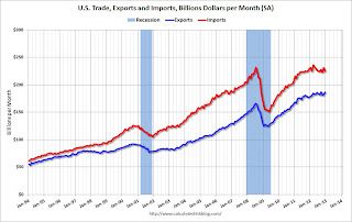 8:30 AM: Trade Balance report for January from the Census Bureau.
 Exports increased in December, and imports decreased and the trade deficit fell sharply.
The consensus is for the U.S. trade deficit to increase to $43.0 billion in January from $38.5 billion in December.
12:00 PM: Q4 Flow of Funds Accounts of the United States from the Federal Reserve.
3:00 PM: Consumer Credit for January from the Federal Reserve. The consensus is for credit to increase $15.0 billion in January.
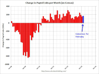 8:30 AM: Employment Report for February. The consensus is for an increase of 171,000 non-farm payroll jobs in February; the economy added 157,000 non-farm payroll jobs in January.
 The consensus is for the unemployment rate to decrease to 7.8% in February.
The second employment graph shows the percentage of payroll jobs lost during post WWII recessions through January.
 The economy has added 6.1 million private sector jobs since employment bottomed in February 2010 (5.5 million total jobs added including all the public sector layoffs).
There are still 2.7 million fewer private sector jobs now than when the recession started in 2007.
10:00 AM: Monthly Wholesale Trade: Sales and Inventories for January. The consensus is for a 0.4% increase in inventories.
Summary for Week ending March 1st
by Calculated Risk on 3/02/2013 08:38:00 AM
It was interesting week. In testimony to Congress, Fed Chairman Ben Bernanke made it clear he will keep the "pedal to the metal" with monetary policy. Meanwhile, Congress keeps tapping on the fiscal policy brakes, this time with "sequestration" budget cuts.
However, even with conflicting policy, the economy is doing OK - at least so far in 2013.
New Home sales in January were at the highest level since July 2008, auto sales were up again in February, the ISM manufacturing index for February was at the highest level since June 2011, weekly initial unemployment claims declined, and consumer sentiment increased. All were better than expected, and it appears the economy was improving before the sequestration budget cuts on March 1st - even with the payroll tax increase this year (although personal consumption expenditures were only up slightly in January).
Also Case-Shiller reported that house prices were up 6.8% in 2012 and finished the year strong. This year-over-year increase strongly suggests house prices bottomed in early 2012.
The ongoing housing recovery and solid auto sales (both leading indicators) suggest the economy will continue to grow for next few years.
Here is a summary of last week in graphs:
• New Home Sales at 437,000 SAAR in January
 Click on graph for larger image in graph gallery.
The Census Bureau reports New Home Sales in January were at a seasonally adjusted annual rate (SAAR) of 437 thousand. This was up from a revised 378 thousand SAAR in December (revised up from 369 thousand).
January is seasonally the weakest month of the year for new home sales, so January has the largest positive seasonal adjustment. Also this was just one month with a sales rate over 400 thousand - and we shouldn't read too much into one month of data. But this was the highest level since July 2008 and it is clear the housing recovery is ongoing.
 On inventory, according to the Census Bureau:
"A house is considered for sale when a permit to build has been issued in permit-issuing places or work has begun on the footings or foundation in nonpermit areas and a sales contract has not been signed nor a deposit accepted."Starting in 1973 the Census Bureau broke this down into three categories: Not Started, Under Construction, and Completed.
This graph shows the three categories of inventory starting in 1973.
The inventory of completed homes for sale was just above the record low. The combined total of completed and under construction is also just above the record low.
This was above expectations of 381,000 sales in January. This is the strongest sales rate since 2008. This was another solid report.
• U.S. Light Vehicle Sales increase to 15.4 million annual rate in February
 Based on an estimate from AutoData Corp, light vehicle sales were at a 15.38 million SAAR in February. That is up 7% from February 2012, and up about 1% from the sales rate last month.
This was above the consensus forecast of 15.2 million SAAR (seasonally adjusted annual rate).
Note: dashed line is current estimated sales rate.
This is another positive sign for the economy going forward.
• ISM Manufacturing index increases in February to 54.2
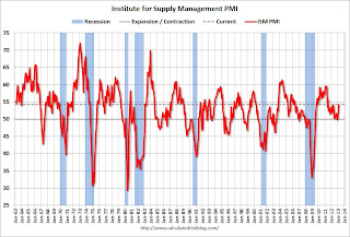 The ISM manufacturing index indicated expansion in February. PMI was at 54.2% in February, up from 53.1% in January. The employment index was at 52.6%, down from 54.0%, and the new orders index was at 57.8%, up from 53.3% in January.
Here is a long term graph of the ISM manufacturing index.
This was above expectations of 52.8% and suggests manufacturing expanded at a faster pace in February.
• Personal Income declined 3.6% in January, Spending increased 0.2%
 The BEA reported: "Personal income decreased $505.5 billion, or 3.6 percent ... in January, according to the Bureau of Economic Analysis. Personal consumption expenditures (PCE) increased $18.2 billion, or 0.2 percent."
The dashed red lines are the quarterly levels for real PCE. Personal spending increased about as expected in January.
Ignore the sharp decline in income and decline in the saving rate - that decline was because some people took income in December to avoid higher taxes in 2013.
• Construction Spending declined in January
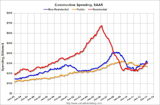 The Census Bureau reported that overall construction spending decreased in January:
 The U.S. Census Bureau of the Department of Commerce announced today that construction spending during January 2013 was estimated at a seasonally adjusted annual rate of $883.3 billion, 2.1 percent below the revised December estimate of $902.6 billion. The January figure is 7.1 percent above the January 2012 estimate of $824.7 billion.This graph shows private residential and nonresidential construction spending, and public spending, since 1993. Note: nominal dollars, not inflation adjusted.
 Private residential spending is 55% below the peak in early 2006, and up 37% from the post-bubble low. Non-residential spending is 25% below the peak in January 2008, and up about 37% from the recent low.
Public construction spending is now 17% below the peak in March 2009 and at the lowest level since 2006 (not inflation adjusted).
The second graph shows the year-over-year change in construction spending.
On a year-over-year basis, private residential construction spending is now up 22%. Non-residential spending is up 4% year-over-year mostly due to energy spending (power and electric). Public spending is down 3% year-over-year.
• Case-Shiller: Comp 20 House Prices increased 6.8% year-over-year in December
 From S&P: Home Prices Closed Out a Strong 2012 According to the S&P/Case-Shiller Home Price Indices
The first graph shows the nominal seasonally adjusted Composite 10 and Composite 20 indices (the Composite 20 was started in January 2000).
The Composite 10 index is off 30.0% from the peak, and up 0.9% in December (SA). The Composite 10 is up 6.2% from the post bubble low set in March (SA).
The Composite 20 index is off 29.2% from the peak, and up 0.9% (SA) in December. The Composite 20 is up 7.0% from the post-bubble low set in March (SA).
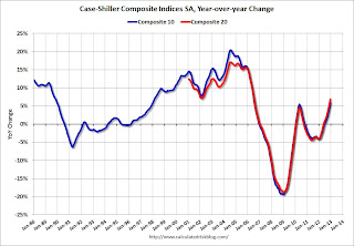 The second graph shows the Year over year change in both indices.
The Composite 10 SA is up 5.9% compared to December 2011.
The Composite 20 SA is up 6.8% compared to December 2011. This was the seventh consecutive month with a year-over-year gain since 2010 (when the tax credit boosted prices temporarily). This was the largest year-over-year gain for the Composite 20 index since 2006.
This was at the consensus forecast for a 6.8% YoY increase.
• Weekly Initial Unemployment Claims decrease to 344,000
The following graph shows the 4-week moving average of weekly claims since January 2000.
 The DOL reports:
In the week ending February 23, the advance figure for seasonally adjusted initial claims was 344,000, a decrease of 22,000 from the previous week's revised figure of 366,000. The 4-week moving average was 355,000, a decrease of 6,750 from the previous week's revised average of 361,750.The dashed line on the graph is the current 4-week average. The four-week average of weekly unemployment claims decreased to 355,000 - just above the lowest 4-week average since the recession.
Weekly claims were below the 360,000 consensus forecast.
• Consumer Sentiment improves
 The final Reuters / University of Michigan consumer sentiment index for February increased to 77.6. The preliminary reading was 76.3, and the January reading was 73.8.
 This was above the consensus forecast of 76.0, but still low. There are a number of factors that impact sentiment including unemployment, gasoline prices and, for 2013, the payroll tax increase, the default threat from Congress and the "sequester" spending cuts. People will slowly adjust to the payroll tax increase, and the threat of default is now behind us ... and sentiment has improved a little ... but the sequester cuts might hurt sentiment in March.
Friday, March 01, 2013
Bernanke: How are long-term rates likely to evolve over coming years?
by Calculated Risk on 3/01/2013 10:00:00 PM
From Fed Chairman Ben Bernanke: Long-Term Interest Rates. Excerpts:
[W]hy are long-term interest rates currently so low? To help answer this question, it is useful to decompose longer-term yields into three components: one reflecting expected inflation over the term of the security; another capturing the expected path of short-term real, or inflation-adjusted, interest rates; and a residual component known as the term premium. Of course, none of these three components is observed directly, but there are standard ways of estimating them. ...
[H]ow are long-term rates likely to evolve over coming years? It is worth pausing to note that, not that long ago, central bankers would have carefully avoided this topic. However, it is now a bedrock principle of central banking that transparency about the likely path of policy, in general, and interest rates, in particular, can increase the effectiveness of policy. In the present context, I would add that transparency may mitigate risks emanating from unexpected rate movements. Thus, let me turn to prospects for long-term rates, starting with the expected path of rates and then turning to deviations from the expected path that may arise.
If, as the FOMC anticipates, the economic recovery continues at a moderate pace, with unemployment slowly declining and inflation expectations remaining near 2 percent, then long-term interest rates would be expected to rise gradually toward more normal levels over the next several years.
Goldman Sachs on Sequestration Cuts
by Calculated Risk on 3/01/2013 07:22:00 PM
I think these excerpts from a research piece by Goldman Sachs economist Alec Phillips are helpful in understanding the issues:
In 2011, Congress passed and the President signed the Budget Control Act, which raised the debt limit by $2.1 trillion and cut $2.1 trillion from projected spending over the following ten years. Caps on discretionary spending levels were estimated to reduce spending by $900bn compared with baseline projections that assumed spending would growth with inflation. The remainder of the savings was to be achieved by the congressional “super committee.” To motivate the super committee, and to ensure deficit reduction even if it failed, the legislation established $1.2 trillion in automatic cuts through 2021 by means of sequestration if the super committee could not agree on at least that much in deficit reduction. The super committee failed to agree on a deficit reduction package, leaving sequestration to take effect.Of course the sequestration cuts could be changed at any time by an agreement between the President and Congress. It seems unlikely that the House will shut down the government in late March (but you never know), and maybe we will see an agreement to reduce or change the sequestration as part of a "continuing resolution". This isn't as obvious as the debt ceiling debate ...
...
The cuts are not that large in the context of the $3.5 trillion federal budget, but sequestration will nevertheless cause real disruptions because the law to implement the cuts is very prescriptive and because they must be phased in relatively quickly once triggered ...
We estimate that sequestration will reduce annualized growth in 2013 by 0.6 percentage point (on a Q4/Q4 basis), with the greatest effects in Q2 and Q3. We expect the effect on growth to wane somewhat starting in Q42013, as the rate of reduction in federal spending becomes more gradual. Although sequestration will reduce the level of spending further in 2014, the rate of change will be much more gradual by that point so the effect on growth should be much smaller. ...
We expect slightly less of an effect on employment compared to the effect on GDP growth. The Congressional Budget Office estimates that the cuts will reduce employment at the end of 2013 by 750,000, or roughly a 0.5% reduction in employment, similar to the 0.6pp reduction in growth it assumes will result from sequestration in 2013.
But it is possible that the direct effect on federal employment may be somewhat smaller than the proportional GDP effect would imply. ... several federal agencies have announced that, at least for FY2013, compensation expenses are likely to be reduced by furloughing federal employees. This means that rather than reducing the number of employees proportionally to the cut, the number of days worked would be reduced instead.
Sequestration has happened before, but not quite on this scale. Meaningful cuts under sequestration were scheduled to take effect in 1986, 1988, and 1990. ... Cuts took effect in each of those years but after allowing the first cut to take effect as planned in FY1986, Congress intervened to reduce the subsequent cuts in FY1988 and FY1990. ...
The key timeframe for action will be late March and April. By late March, Congress will need to pass a new “continuing resolution” (CR) to temporarily extend spending authority, which was last extended before the 2012 election and expires March 27.
U.S. Light Vehicle Sales increase to 15.4 million annual rate in February
by Calculated Risk on 3/01/2013 03:58:00 PM
Based on an estimate from AutoData Corp, light vehicle sales were at a 15.38 million SAAR in February. That is up 7% from February 2012, and up about 1% from the sales rate last month.
This was above the consensus forecast of 15.2 million SAAR (seasonally adjusted annual rate).
This graph shows the historical light vehicle sales from the BEA (blue) and an estimate for February (red, light vehicle sales of 15.38 million SAAR from AutoData).
 Click on graph for larger image.
This is a solid start to the new year. After three consecutive years of double digit auto sales growth, the growth rate will probably slow in 2013 - but this will still be another positive year for the auto industry.
Even if sales average the January / February rate all year, Total sales would be up about 6% from 2012.
The second graph shows light vehicle sales since the BEA started keeping data in 1967.
 Note: dashed line is current estimated sales rate.
This shows the huge collapse in sales in the 2007 recession, and that sales have increased significantly from the bottom.
This is another positive sign for the economy going forward.
Construction Spending declined in January
by Calculated Risk on 3/01/2013 12:35:00 PM
Catching up ...
A few key themes:
1) Private residential construction is usually the largest category for construction spending, but there was a huge collapse in spending following the housing bubble (as expected). Private residential is now about even with private non-residential, and residential will probably be the largest category of construction spending in 2013. Usually private residential construction leads the economy, so this is a good sign going forward.
2) Private non-residential construction spending usually lags the economy. There was some increase this time, mostly related to energy and power - but the key sectors of office, retail and hotels are still at very low levels.
3) Public construction spending has declined to 2006 levels (not adjusted for inflation). This has been a drag on the economy for almost 4 years.
The Census Bureau reported that overall construction spending decreased in January:
The U.S. Census Bureau of the Department of Commerce announced today that construction spending during January 2013 was estimated at a seasonally adjusted annual rate of $883.3 billion, 2.1 percent below the revised December estimate of $902.6 billion. The January figure is 7.1 percent above the January 2012 estimate of $824.7 billion.Private construction spending decreased due to less spending on power and electric, and public construction spending declined too:
Spending on private construction was at a seasonally adjusted annual rate of $614.2 billion, 2.6 percent below the revised December estimate of $630.9 billion. Residential construction was at a seasonally adjusted annual rate of $304.6 billion in January, nearly the same as the revised December estimate of $304.7 billion. ...
In January, the estimated seasonally adjusted annual rate of public construction spending was $269.0 billion, 1.0 percent below the revised December estimate of $271.7 billion.
 Click on graph for larger image.
This graph shows private residential and nonresidential construction spending, and public spending, since 1993. Note: nominal dollars, not inflation adjusted.
Private residential spending is 55% below the peak in early 2006, and up 37% from the post-bubble low. Non-residential spending is 25% below the peak in January 2008, and up about 37% from the recent low.
Public construction spending is now 17% below the peak in March 2009 and at the lowest level since 2006 (not inflation adjusted).
 The second graph shows the year-over-year change in construction spending.
On a year-over-year basis, private residential construction spending is now up 22%. Non-residential spending is up 4% year-over-year mostly due to energy spending (power and electric). Public spending is down 3% year-over-year.
ISM Manufacturing index increases in February to 54.2, Consumer Sentiment improves
by Calculated Risk on 3/01/2013 10:00:00 AM
The ISM manufacturing index indicated expansion in February. PMI was at 54.2% in February, up from 53.1% in January. The employment index was at 52.6%, down from 54.0%, and the new orders index was at 57.8%, up from 53.3% in January.
From the Institute for Supply Management: February 2013 Manufacturing ISM Report On Business®
Economic activity in the manufacturing sector expanded in February for the third consecutive month, and the overall economy grew for the 45th consecutive month, say the nation's supply executives in the latest Manufacturing ISM Report On Business®.
 Click on graph for larger image.
Here is a long term graph of the ISM manufacturing index.
The report was issued today by Bradley J. Holcomb, CPSM, CPSD, chair of the Institute for Supply Management™ Manufacturing Business Survey Committee. "The PMI™ registered 54.2 percent, an increase of 1.1 percentage points from January's reading of 53.1 percent, indicating expansion in manufacturing for the third consecutive month. This month's reading reflects the highest PMI™ since June 2011, when the index registered 55.8 percent. The New Orders Index registered 57.8 percent, an increase of 4.5 percent over January's reading of 53.3 percent, indicating growth in new orders for the second consecutive month. As was the case in January, all five of the PMI™'s component indexes — new orders, production, employment, supplier deliveries and inventories — registered in positive territory in February. In addition, the Backlog of Orders, Exports and Imports Indexes all grew in February relative to January."This was above expectations of 52.8% and suggests manufacturing expanded at a faster pace in February.
Final consumer sentiment for February:
 The final Reuters / University of Michigan consumer sentiment index for February increased to 77.6. The preliminary reading was 76.3, and the January reading was 73.8.
 This was above the consensus forecast of 76.0, but still low. There are a number of factors that impact sentiment including unemployment, gasoline prices and, for 2013, the payroll tax increase, the default threat from Congress and the "sequester" spending cuts. People will slowly adjust to the payroll tax increase, and the threat of default is now behind us ... and sentiment has improved a little ... but the sequester cuts might hurt sentiment in March.
Personal Income declined 3.6% in January, Spending increased 0.2%
by Calculated Risk on 3/01/2013 08:48:00 AM
The BEA released the Personal Income and Outlays report for January:
Personal income decreased $505.5 billion, or 3.6 percent ... in January, according to the Bureau of Economic Analysis. Personal consumption expenditures (PCE) increased $18.2 billion, or 0.2 percent.The following graph shows real Personal Consumption Expenditures (PCE) through January (2005 dollars). Note that the y-axis doesn't start at zero to better show the change.
...
Real PCE -- PCE adjusted to remove price changes -- increased 0.1 percent in January, the same increase as in December. ... PCE price index -- the price index for PCE increased less than 0.1 percent in January, in contrast to a decrease of less than 0.1 percent in December. The PCE price index, excluding food and energy, increased 0.1 percent, compared with an increase of less than 0.1 percent.
...
Personal saving -- DPI less personal outlays -- was $283.9 billion in January, compared with $797.4 billion in December. The personal saving rate -- personal saving as a percentage of disposable personal income -- was 2.4 percent in January, compared with 6.4 percent in December.
 Click on graph for larger image.
The dashed red lines are the quarterly levels for real PCE. Personal spending increased about as expected in January.
Ignore the sharp decline in income and decline in the saving rate - that decline was because some people took income in December to avoid higher taxes in 2013.


