by Calculated Risk on 3/04/2011 03:54:00 PM
Friday, March 04, 2011
Participation Rate Update
Last year I looked at some of the cyclical and long term trends for the participation rate: Labor Force Participation Rate: What will happen?. I concluded that most of the decline in the participation rate is due to changes in demographics - not cyclical. I also noted that it is possible that long term trends, especially more older workers participating in the labor force, combined with some cyclical improvement, could push the participation rate up a little over the next few years, and then the participation rate would start declining again.
What happens to the participation rate is an important question. If the Civilian noninstitutional population (over 16 years old) grows by about 2 million per year - and the participation rate stays flat - the economy will need to add about 100 thousand jobs per month to keep the unemployment rate steady at 8.9%.
If the population grows faster (say 2.5 million per year), and/or the participation rate rises, it could take significantly more jobs per month to hold the unemployment rate steady. As an example, if the working age population grows 2.5 million per year and the participation rate rises to 65% (from 64.2%) over the next two years, the economy will need to add 200 thousand jobs per month to hold the unemployment rate steady.
That is why forecasting the participation rate is important - and why reports of the number of jobs needed to hold the unemployment rate steady are all over the place (and can be very confusing - and I'm guilty of using different numbers).
Here is a look at some the long term trends (updating graphs through February 2011):
 Click on graph for larger image in graph gallery.
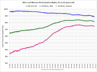
This graph shows the changes in the participation rates for men and women since 1960 (in the 25 to 54 age group - the prime working years).
The participation rate for women increased significantly from the mid 30s to the mid 70s and has mostly flattened out. The participation rate for men has decreased from the high 90s to 88.8% in February 2011. (up slightly from January)
There will probably be some "bounce back" for both men and women (some of the recent decline is probably cyclical), but the long term trend for men is down.
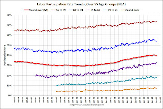
 This graph shows that participation rates for several key age groups.
There are a few key long term trends:
• The participation rate for the '16 to 19' age group has been falling for some time (red). This fell to a record low 33.5% in February.
• The participation rate for the 'over 55' age group has been rising since the mid '90s (purple), although this has stalled out a little recently (perhaps cyclical).
• The participation rate for the '20 to 24' age group fell recently too (perhaps more education before joining the labor force). I expect the sharp decline over the last couple of years to turn around quickly as the job market improves.
 The third graph shows the participation rate for several over 55 age groups. The red line is the '55 and over' total seasonally adjusted. All of the other age groups are Not Seasonally Adjusted (NSA).
The participation rate is generally trending up for all older age groups. And this might push the overall participation rate up over the next 5 years. After that the 'over 55' participation rate will probably start to decline as the oldest baby boomers move into even older age groups.
I've been expecting some small bounce back in the participation rate, but my guess last year was probably too high. I know some analysts who think that it will just stay flat for a few years before declining again. This will be a key number to watch over the next few years.
Here are the earlier employment posts (with graphs):
• February Employment Report: 192,000 Jobs, 8.9% Unemployment Rate
• Employment Summary and Part Time Workers, Unemployed over 26 Weeks
• Duration of Unemployment, Unemployment by Education, Diffusion Indexes
• Employment Graph Gallery
Duration of Unemployment, Unemployment by Education, Diffusion Indexes
by Calculated Risk on 3/04/2011 01:35:00 PM
By request, here are a few more graphs ...
 Click on graph for larger image in graph gallery.
This graph shows the duration of unemployment as a percent of the civilian labor force. The graph shows the number of unemployed in four categories: less than 5 week, 6 to 14 weeks, 15 to 26 weeks, and 27 weeks or more.
In general, all four categories are trending down. The less than 5 week category appears to be back to normal (fits with the initial weekly claims data).
 This graph shows the unemployment rate by four levels of education (all groups are 25 years and older).
Unfortunately this data only goes back to 1992 and only includes one previous recession (the stock / tech bust in 2001). Clearly education matters with regards to the unemployment rate - and it appears all four groups are now trending down.
 This is a little more technical. The BLS diffusion index for total private employment was at 68.2 in February, the highest level since May 1998. For manufacturing, the diffusion index decreased to 64.2.
 Think of this as a measure of how widespread job gains are across industries. The further from 50 (above or below), the more widespread the job losses or gains reported by the BLS. From the BLS:
Figures are the percent of industries with employment increasing plus one-half of the industries with unchanged employment, where 50 percent indicates an equal balance between industries with increasing and decreasing employment.The level of both indexes was a clear positive in the February employment report.
What we want is a large number of high paying jobs added each month, spread across many industries. What we got was some improvement in jobs added, although not high paying jobs - but fairly widespread.
Best to all
Here are the earlier employment posts (with graphs):
• February Employment Report: 192,000 Jobs, 8.9% Unemployment Rate
• Employment Summary and Part Time Workers, Unemployed over 26 Weeks
• Employment Graph Gallery
Employment Summary and Part Time Workers, Unemployed over 26 Weeks
by Calculated Risk on 3/04/2011 10:25:00 AM
Here are a few more graphs based on the employment report ...
Percent Job Losses During Recessions
 Click on graph for larger image in graph gallery.
This graph shows the job losses from the start of the employment recession, in percentage terms - this time aligned at the start of the recession.
In the previous post, the graph showed the job losses aligned at maximum job losses.
In terms of lost payroll jobs, the 2007 recession is by far the worst since WWII, and the "recovery" for payroll jobs is one of the slowest.
Part Time for Economic Reasons
 From the BLS report:
The number of persons employed part time for economic reasons (sometimes referred to as involuntary part-time workers) was essentially unchanged at 8.3 million in February. These individuals were working part time because their hours had been cut back or because they were unable to find a full-time job.The number of workers only able to find part time jobs (or have had their hours cut for economic reasons) declined slightly to 8.34 million in February from 8.407 million in January.
These workers are included in the alternate measure of labor underutilization (U-6) that declined to 15.9% in February from 16.1% in January. Still very high, but improving.
Unemployed over 26 Weeks
 This graph shows the number of workers unemployed for 27 weeks or more.
 According to the BLS, there are 5.993 million workers who have been unemployed for more than 26 weeks and still want a job. This was down from 6.21 million in January. This is still very high.
Summary
This wasn't a great report. Heck, it wasn't a "good" report. But it was a little better than most recent reports.
If we average the last two months together, the 63,000 payroll jobs added in January and the 192,000 payroll jobs in February, that gives 127,500 payroll jobs per month. And that is a barely enough to keep up with the growth in the labor force. Private payrolls were a little better at an average of 145,000 per month, as state and local governments continued to lay off workers (something we expect all year).
The decline in the unemployment rate from 9.0% to 8.9%, was good news, especially since the participation rate was unchanged at 64.2%. Note: This is the percentage of the working age population in the labor force.
The decreases for the long term unemployed, and for the number of part time workers for economic reasons, and the decline in U-6 to 15.9% is all welcome news - although the levels are still very high.
The average workweek was unchanged at 34.2 hours, and average hourly earnings ticked up 1 cent. Both disappointing.
It is interesting to note that construction has now added payroll jobs in 2011. I think construction will add payroll jobs this year for the first time since 2005.
Overall this was a small step in the right direction.
• Earlier Employment post: February Employment Report: 192,000 Jobs, 8.9% Unemployment Rate
February Employment Report: 192,000 Jobs, 8.9% Unemployment Rate
by Calculated Risk on 3/04/2011 08:30:00 AM
From the BLS:
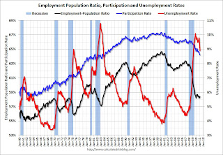
Nonfarm payroll employment increased by 192,000 in February, and the unemployment rate was little changed at 8.9 percent, the U.S. Bureau of Labor Statistics reported today.The following graph shows the employment population ratio, the participation rate, and the unemployment rate.
...
The change in total nonfarm payroll employment for December was revised from +121,000 to +152,000, and the change for January was revised from +36,000 to +63,000.
 Click on graph for larger image.
The unemployment rate decreased to 8.9% (red line).
The Labor Force Participation Rate was unchanged at 64.2% in February (blue line). This is the lowest level since the early '80s. (This is the percentage of the working age population in the labor force. The participation rate is well below the 66% to 67% rate that was normal over the last 20 years, although some of the decline is due to the aging population.)
The Employment-Population ratio was unchanged at 58.4% in February (black line).
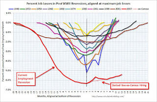
 The second graph shows the job losses from the start of the employment recession, in percentage terms aligned at maximum job losses. The dotted line is ex-Census hiring.
 The current employment recession is by far the worst recession since WWII in percentage terms, and 2nd worst in terms of the unemployment rate (only the early '80s recession with a peak of 10.8 percent was worse).
This was about at expectations for payroll jobs. Adding January and February together gives 255,000 jobs or about 127 thousand per month. I'll have much more soon ...
Thursday, March 03, 2011
Misc: Fed Watch, Merle Hazard, Employment and more
by Calculated Risk on 3/03/2011 10:00:00 PM
• Earlier Employment Situation Preview: Some Improvement, but Still Grim.
• From Tim Duy's Fed Watch: Game Changers?
All in all, incoming data reinforce my sense that the upside and downside risks to the forecast are intensifying, which could make for a very interesting few months. ... The possibility of some real game changing developments is at hand. At this moment, I think the balance of risks are now on the upside, but am very, very conscious of how quickly that balance can change in the wake of a commodity price shock. I would be wary about letting the depth of this recession interfere with your read of the data, just as wary as you should be about letting the data tempt you from thinking it is time to push stimulative policies into reverse.CR: There are several downside risks: higher oil prices or even a supply shock, the European financial crisis, state and local government fiscal issues, and two sides of the inflation coin (inflation spreads or policymakers overreact). We live in interesting times!
• Some interesting thoughts on retail space, from the WSJ: As Big Boxes Shrink, They Also Rethink
Major big-box retailers have been shifting to smaller stores—and scratching around for more profitable ways to fill under-used spaces as they go about reinventing themselves.• Last month Paul Solman at PBS NewsHour Making Sen$e had a lyric contest. Here is the song from Merle Hazard to Paul Simon's The 59th Street Bridge Song (Feelin' Groovy)
Some are becoming landlords, turning excess space over to other businesses.


