 RSS Feed
 by Calculated Risk on 6/01/2005 11:36:00 PM
Wednesday, June 01, 2005
No Housing Bubble?
Last week, Barry Ritholtz of The Big Picture wrote: "Don't Buy Housing Bubble Propaganda". I recommend it.
Today, Dr. Richard Rosen (Senior Economist Chicago Federal Reserve Bank) release a Fed Letter: "Explaining recent changes in home prices". Also worth reading.
Speculation, excessive leverage, loose lending practices are all evidence of a bubble.
Price Rent Ratio Update
by Calculated Risk on 6/01/2005 05:03:00 PM
OFHEO released their Q1 2005 report showing a 12.5% annual housing price increase nationwide over the past year. Kash on Angry Bear breaks down the data by key metropolitan areas and provides a graph of inflation adjusted house prices: New House Price Data.
Another way to look at the data is to compare house prices vs. equivalent owner's rent for different areas of the Country. This measure of fundamental housing value, called the price-rent ratio, was suggested by the Federal Reserve's Krainer and Wei in "House Prices and Fundamental Value". The following graph shows the U.S. and Los Angeles price-rent ratios since 1982. The price component is from the OFHEO home price index and the rent series is from the BLS owner's equivalent rent index. 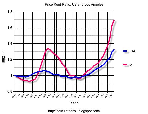
Click on graphs for larger image.
The LA housing bubble of the late '80s is very clear. After the bubble burst, it took several years for the Price-Rent Ratio to return to normal. For a graph of the LA bust see "After the Boom".
Krainer and Wei "found that most of the variance in the price-rent ratio is due to changes in future returns and not to changes in rents. This is relevant because it suggests the likely future path of the ratio. If the ratio is to return to its average level, it will probably do so through slower house price appreciation."
The owner's rent equivalent data series from the BLS starts in '97 for many areas. Using (1997 = 1) the following graph compares the Price-Rent ratio for Los Angeles, Washington D.C., Miami and Wichita / Peoria.
It should come as no surprise that LA, DC and Miami house prices are all significantly above the Owner's equivalent rent.
But is there a bubble in Peoria? The data suggests that housing in Peoria, Wichita, and Indianapolis are all about 15% overvalued. However I don't expect nominal price decreases in those areas. More likely is slow appreciation (below the inflation rate) for a few years until rents catch up with house prices.
The Price-Rent ratio suggests that housing is overvalued in most of the United States and significantly overvalued in the larger metropolitan areas.
OFHEO: House Prices Continue to Rise Rapidly
by Calculated Risk on 6/01/2005 11:13:00 AM
OFHEO released their Q1 2005 report: "House Price Index Shows a 12.5 Percent Increase Over the Past Year"
WASHINGTON, D.C. – Average U.S. home prices increased 12.50 percent from the first quarter of 2004 through the first quarter of 2005. Appreciation for the most recent quarter was 2.21 percent, or an annualized rate of 8.82 percent. The new data represent the largest four quarter increase since the third quarter of 2004, when appreciation surpassed any increase in over 25 years. The figures were released today by OFHEO Acting Director Stephen A. Blumenthal, as part of the House Price Index (HPI), a quarterly report analyzing housing price appreciation trends.
“The House Price Index shows the rise in house prices continues at an extremely strong pace and raises the potential for declines in some areas later on,” said OFHEO Chief Economist Patrick Lawler.
More to come ...
Tuesday, May 31, 2005
UK: Retail Sales Continue Slide
by Calculated Risk on 5/31/2005 09:00:00 PM
UK's retailers suffered their third consecutive month of declining sales, according to the Independent.
'...the CBI said retailers suffered their third successive monthly fall in sales - making it the worst quarter since the early recession of the early Nineties.More from the Independent:
There was a further blow for retailers from a survey showing the Bank Holiday weekend provided a lacklustre kick-start to half-term holiday trading. John Butler, the UK economist at HSBC, said: "Households no longer intend to make a major purchase. The big-ticket durable boom is over along with the boom in mortgage equity withdrawal."'
'The CBI survey, which covered 226 companies representing four out of 10 shops across the UK, said the number reporting a fall in sales compared with a year ago outweighed those seeing a rise by 7 per cent. This was an improvement from the balance of minus 14 per cent in April but left the rolling three-monthly average at its lowest level sinc e August 1992.
FootFall said the number of visitors to Britain's major shopping centres over the three-day weekend was 1.3 per cent lower than a year ago, driven by a 7 per cent slump in footfall on Monday.'
For more on the UK retail slump:
Times: Retailers expect slowdown to stay for summer
Financial Express: ‘UK retail sales fell again in May’
"Broadly speaking, the categories of goods most closely correlated with housing transactions have fared worse than the average over the past year," said John Longworth, executive director of ASDA and chairman of the CBI's survey panel.Retail Week: Retail sales fall for the third month
Asda executive director and chairman of the CBI's DTS panel John Longworth said: “Sales volumes improved between April and May, but volumes remain a little lower than a year ago and prices are on a downward trend.”It is possible that the UK is leading the US into an economic slowdown. On Angry Bear I presented a chart showing that the US Fed rate increases are about 6 to 8 months behind the BoE. In the UK it started with a housing slowdown and has now moved to retail.
"Sales of groceries, books and stationery are up on a year ago, but those of big ticket items, furniture, carpets, DIY goods and clothing are down,” he added.
Monday, May 30, 2005
Housing and M3
by Calculated Risk on 5/30/2005 01:47:00 AM
My weekly post is up on Angry Bear: Housing, the Fed and M3
Earlier I linked to Federal Reserve Vice Chairman Ferguson's remarks on housing.
Click on graph for larger image.
Expanding on Dr. Ferguson's analysis, this graph shows price adjusted M3 since 1975. The vertical lines indicate when housing peaked in the previous cycles.
It is important to repeat Dr. Ferguson’s caution regarding not confusing correlation with causation, but it does appear that housing has peaked in the past when price adjusted M3 has peaked.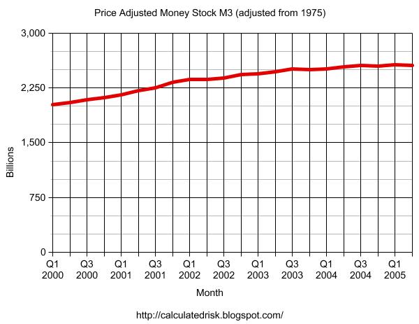
And the second graph shows price adjusted M3 since Q1 2000. It appears that M3 is peaking right now.
We will have to wait to see if housing is peaking. But one thing is certain, the number of articles on housing is setting new highs!
See my previous posts and Patrick's links for a list of recent articles.


