 RSS Feed
 by Calculated Risk on 4/24/2024 08:51:00 PM
Wednesday, April 24, 2024
Thursday: Q1 GDP, Unemployment Claims, Pending Home Sales
 Note: Mortgage rates are from MortgageNewsDaily.com and are for top tier scenarios.
Thursday:
• At 8:30 AM ET, Gross Domestic Product, 1st quarter 2024 (Advance estimate). The consensus is that real GDP increased 2.1% annualized in Q1, down from 3.4% in Q4.
• Also at 8:30 AM, The initial weekly unemployment claims report will be released. The consensus is for 210 thousand initial claims, down from 212 thousand last week.
• At 10:00 AM: Pending Home Sales Index for March. The consensus is for a 2.0% decrease in the index.
• At 11:00 AM: the Kansas City Fed manufacturing survey for April.
April Vehicle Sales Forecast: 15.8 million SAAR, Up 1% YoY
by Calculated Risk on 4/24/2024 05:54:00 PM
From WardsAuto: April U.S. Light-Vehicle Sales to Start Second Quarter with Lukewarm Growth (pay content). Brief excerpt:
The second quarter will be key to 2024’s total results, as demand must continue growing during April-June for the entire year to top 16 million units for the first time in five years. The period could be a leading indicator of how much automakers ultimately are willing to lay off incentives and other forms of discounting, vs. implementing production slowdowns, to keep inventory in check if demand does not pick up significantly.
emphasis added
 Click on graph for larger image.
This graph shows actual sales from the BEA (Blue), and Wards forecast for April (Red).
On a seasonally adjusted annual rate basis, the Wards forecast of 15.8 million SAAR, would be up 2% from last month, and up 1% from a year ago.
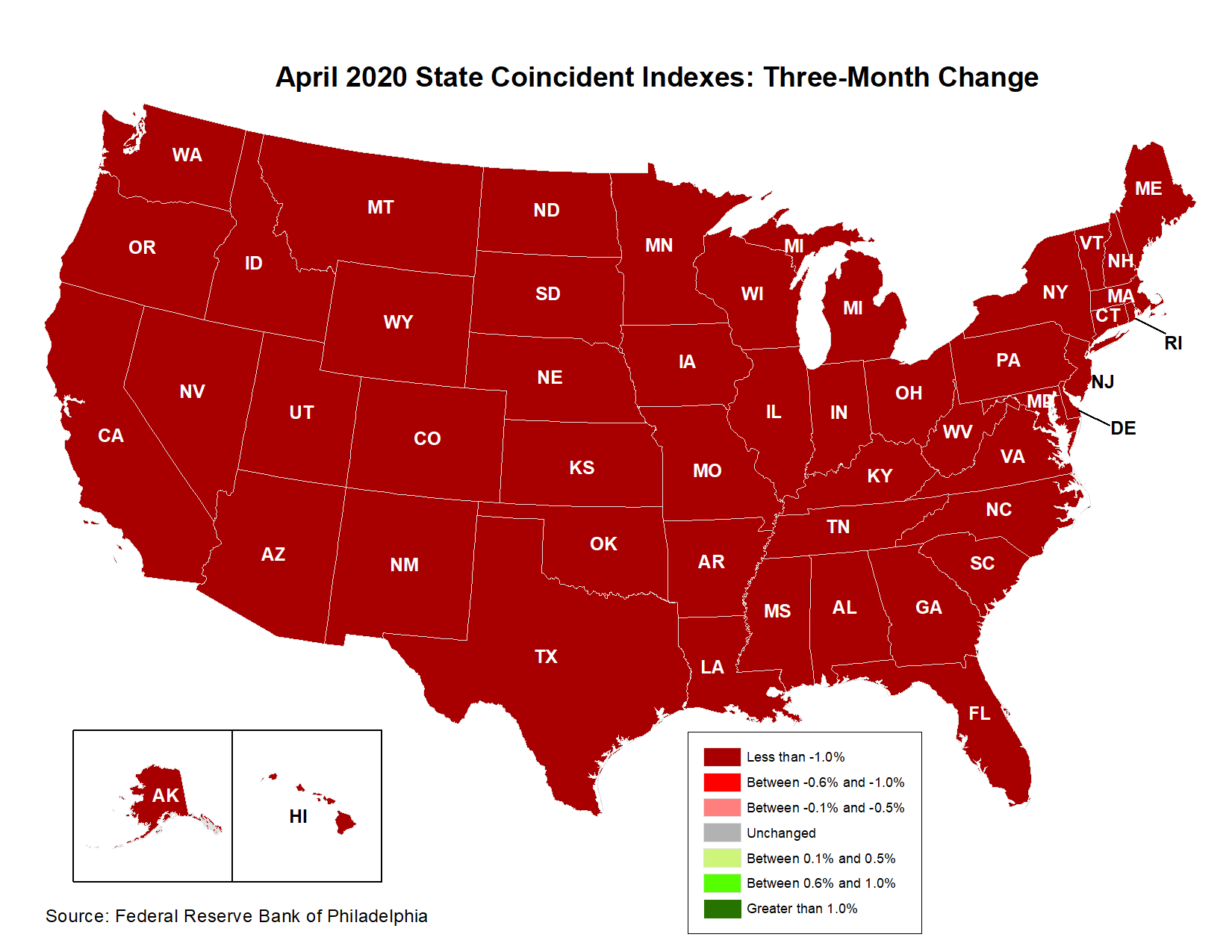
Philly Fed: State Coincident Indexes Increased in 44 States in March (3-Month Basis)
by Calculated Risk on 4/24/2024 04:11:00 PM
From the Philly Fed:
The Federal Reserve Bank of Philadelphia has released the coincident indexes for the 50 states for March 2024. Over the past three months, the indexes increased in 44 states, decreased in five states, and remained stable in one, for a three-month diffusion index of 78. Additionally, in the past month, the indexes increased in 41 states, decreased in two states, and remained stable in seven, for a one-month diffusion index of 78. For comparison purposes, the Philadelphia Fed has also developed a similar coincident index for the entire United States. The Philadelphia Fed’s U.S. index increased 0.7 percent over the past three months and 0.3 percent in March.Note: These are coincident indexes constructed from state employment data. An explanation from the Philly Fed:
emphasis added
The coincident indexes combine four state-level indicators to summarize current economic conditions in a single statistic. The four state-level variables in each coincident index are nonfarm payroll employment, average hours worked in manufacturing by production workers, the unemployment rate, and wage and salary disbursements deflated by the consumer price index (U.S. city average). The trend for each state’s index is set to the trend of its gross domestic product (GDP), so long-term growth in the state’s index matches long-term growth in its GDP.
 Click on map for larger image.
Here is a map of the three-month change in the Philly Fed state coincident indicators. This map was all red during the worst of the Pandemic and also at the worst of the Great Recession.
The map is almost all positive on a three-month basis.
Source: Philly Fed.
 And here is a graph is of the number of states with one month increasing activity according to the Philly Fed.
 This graph includes states with minor increases (the Philly Fed lists as unchanged).
In March, 44 states had increasing activity including minor increases.
In March, 44 states had increasing activity including minor increases.
AIA: "Architecture firm billings retreat further in March"; Multi-family Billings Decline for 20th Consecutive Month
by Calculated Risk on 4/24/2024 01:16:00 PM
Note: This index is a leading indicator primarily for new Commercial Real Estate (CRE) investment.
From the AIA: ABI March 2024: Architecture firm billings retreat further in March
Business conditions at architecture firms softened in March, as the AIA/Deltek Architecture Billings Index (ABI) score declined to 43.6 for the month. This marked the 14th consecutive month of declining billings at firms as inflation, supply chain issues, and other economic challenges continue to affect business. While inquiries into new projects have continued to grow during that period, it has been at a slower pace than in 2021 and 2022. More notably, the value of new signed design contracts was flat in March, which has generally been the trend for the last year and a half. This shows that clients are interested in starting new projects but remain hesitant to sign a contract and officially commit to those projects. However, most firms report that they still have strong project backlogs of 6.6 months, on average, so even with the ongoing soft patch, they still have work in the pipeline.• Northeast (46.0); Midwest (45.2); South (45.3); West (47.6)
Architecture firm billings also continued to decline at firms in all regions of the country, and at firms of all specializations in March, just like in February. Regionally, business conditions were softest at firms located in the Midwest and South. By specialization, billings declined faster at firms with a commercial/industrial specialization and remained weak at firms with a multifamily residential specialization. However, firms with an institutional specialization reported billings that were essentially flat, marking the third straight month of that trend.
...
The ABI score is a leading economic indicator of construction activity, providing an approximately nine-to-twelve-month glimpse into the future of nonresidential construction spending activity. The score is derived from a monthly survey of architecture firms that measures the change in the number of services provided to clients.
emphasis added
• Sector index breakdown: commercial/industrial (42.9); institutional (49.9); multifamily residential (44.2)
 Click on graph for larger image.
This graph shows the Architecture Billings Index since 1996. The index was at 43.6 in March, down from 49.5 in February. Anything below 50 indicates a decrease in demand for architects' services.
Note: This includes commercial and industrial facilities like hotels and office buildings, multi-family residential, as well as schools, hospitals and other institutions.
This index usually leads CRE investment by 9 to 12 months, so this index suggests a slowdown in CRE investment in 2024.
Note that multi-family billing turned down in August 2022 and has been negative for twenty consecutive months (with revisions). This suggests we will see a further weakness in multi-family starts.
Final Look at Local Housing Markets in March
by Calculated Risk on 4/24/2024 09:49:00 AM
Today, in the Calculated Risk Real Estate Newsletter: Final Look at Local Housing Markets in March
A brief excerpt:
After the National Association of Realtors® (NAR) releases the monthly existing home sales report, I pick up additional local market data that is reported after the NAR. This is the final look at local markets in March.There is much more in the article.
I’ve added a comparison of active listings, new listings, and closings to the same month in 2019 (for markets with available data). This gives us a sense of the current low level of sales and inventory, and also shows some significant regional differences.
The big stories for March were that existing home sales decreased to 4.19 million on a seasonally adjusted annual rate basis (SAAR), and new listings were up YoY for the 6th consecutive month although new listing growth slowed.
...
And a table of March sales.
...
This was a 10.3% year-over-year decrease NSA for these markets. This is about the same as the 9.7% decline NSA reported by the NAR.
However, there were two fewer working days in March 2024 compared to March 2023, so sales Seasonally Adjusted were down less year-over-year than Not Seasonally Adjusted sales.
...
Note for next month (April sales): There were two more working days in April 2024 compared to April 2023, so seasonally adjusted sales will be lower than the NSA data suggests.
...
More local data coming in May for activity in April!

MBA: Mortgage Applications Decreased in Weekly Survey
by Calculated Risk on 4/24/2024 07:00:00 AM
From the MBA: Mortgage Applications Decrease in Latest MBA Weekly Survey
Mortgage applications decreased 2.7 percent from one week earlier, according to data from the Mortgage Bankers Association’s (MBA) Weekly Mortgage Applications Survey for the week ending April 19, 2024.
The Market Composite Index, a measure of mortgage loan application volume, decreased 2.7 percent on a seasonally adjusted basis from one week earlier. On an unadjusted basis, the Index decreased 2 percent compared with the previous week. The Refinance Index decreased 6 percent from the previous week and was 3 percent higher than the same week one year ago. The seasonally adjusted Purchase Index decreased 1 percent from one week earlier. The unadjusted Purchase Index increased 0.2 percent compared with the previous week and was 15 percent lower than the same week one year ago.
“Mortgage rates continued to move higher last week, reaching their highest levels since late 2023 and putting a damper on applications activity. The 30-year fixed rate increased for the third consecutive week to 7.24 percent, the highest since November 2023,” said Joel Kan, MBA’s Vice President and Deputy Chief Economist. “Purchase applications declined, as home buyers delayed their purchase decisions due to strained affordability and low supply. The ARM share of applications increased to 7.6 percent, consistent with the upward trend in rates, as buyers look to reduce their potential monthly payments.”
...
The average contract interest rate for 30-year fixed-rate mortgages with conforming loan balances ($766,550 or less) increased to 7.24 percent from 7.13 percent, with points increasing to 0.66 from 0.65 (including the origination fee) for 80 percent loan-to-value ratio (LTV) loans.
emphasis added
 Click on graph for larger image.
The first graph shows the MBA mortgage purchase index.
According to the MBA, purchase activity is down 15% year-over-year unadjusted.
Red is a four-week average (blue is weekly).
Purchase application activity is up slightly from the lows in late October 2023, and below the lowest levels during the housing bust.

The second graph shows the refinance index since 1990.
With higher mortgage rates, the refinance index declined sharply in 2022, and has mostly flat lined since then.
Tuesday, April 23, 2024
Wednesday: Durable Goods, Architecture Billings Index
by Calculated Risk on 4/23/2024 08:27:00 PM
 Note: Mortgage rates are from MortgageNewsDaily.com and are for top tier scenarios.
Wednesday:
• At 7:00 AM ET, The Mortgage Bankers Association (MBA) will release the results for the mortgage purchase applications index.
• At 8:30 AM, Durable Goods Orders for March from the Census Bureau. The consensus is for a 2.0% increase in durable goods orders.
• During the day, The AIA's Architecture Billings Index for March (a leading indicator for commercial real estate).
The Normal Seasonal Pattern for Median House Prices
by Calculated Risk on 4/23/2024 04:49:00 PM
Last week, in the CalculatedRisk Real Estate Newsletter on March existing home sales, NAR: Existing-Home Sales Decreased to 4.19 million SAAR in March; Median House Prices Increased 4.8% Year-over-Year, I noted that median prices were up year-over-year (median prices are distorted by the mix).
Seasonally prices typically peak in June (closed sales are mostly for contracts signed in April and May).
And seasonally prices usually bottom the following January (contracts signed in November and December).
The recent surge in prices started mid-year 2020 and ran through Q1 2022 when mortgage rates started increasing significantly.
The 2024 increase in median prices from January to March was about the same as in 2018 and 2019.
Here is a table of the seasonal percentage increases from January to March, and from March to June (the usual seasonal peak) over the last several years. The third row is the total percentage increase from January to June.
The last row shows the seasonal decline from June to December. Note: In 2019, prices only declined 3.8% in the 2nd half of the year as mortgage rates declined into the mid-3s (pre-pandemic low was 3.5% on a 30-year mortgage according to Freddie MAC PMMS).
In 2020, prices continued to increase in the 2nd half of the year and didn't peak seasonally until October. And prices only declined slightly in the 2nd half of 2021.
| 2018 | 2019 | 2020 | 2021 | 2022 | 2023 | 2024 | |
|---|---|---|---|---|---|---|---|
| Jan to Mar | 3.7% | 4.1% | 5.4% | 7.5% | 7.1% | 4.0% | 3.9% |
| Mar to Jun | 9.6% | 9.9% | 4.9% | 12.4% | 9.1% | 9.3% | NA |
| Total Jan to Jun | 13.7% | 14.4% | 10.6% | 20.8% | 16.8% | 13.7% | NA |
| Jun to Dec | -7.0% | -3.8% | 5.0% | -2.2% | -11.4% | -7.0% | NA |
The 2024 increase in median prices from January to March was about the same as in 2018 and 2019.
Normally we'd expect median prices to increase 9% to 10% over the next three months, before declining in the 2nd half of the year. With more inventory, the seasonal pattern will be interesting this year.
New Home Sales Increase to 693,000 Annual Rate in March; Median New Home Price is Down 13% from the Peak
by Calculated Risk on 4/23/2024 10:40:00 AM
Today, in the Calculated Risk Real Estate Newsletter: New Home Sales Increase to 693,000 Annual Rate in March
Brief excerpt:
The Census Bureau reports New Home Sales in March were at a seasonally adjusted annual rate (SAAR) of 693 thousand. The previous three months were revised down combined.There is much more in the article.
...
The next graph shows new home sales for 2023 and 2024 by month (Seasonally Adjusted Annual Rate). Sales in March 2024 were up 8.3% from March 2023.
...
Note that the median and average price are down due to the mix of homes sold, not because of large price declines. Homebuilders are building less expensive homes to keep up volumes.

New Home Sales Increase to 693,000 Annual Rate in March
by Calculated Risk on 4/23/2024 10:00:00 AM
The Census Bureau reports New Home Sales in March were at a seasonally adjusted annual rate (SAAR) of 693 thousand.
The previous three months were revised down combined.
Sales of new single‐family houses in March 2024 were at a seasonally adjusted annual rate of 693,000, according to estimates released jointly today by the U.S. Census Bureau and the Department of Housing and Urban Development. This is 8.8 percent above the revised February rate of 637,000 and is 8.3 percent above the March 2023 estimate of 640,000.
emphasis added
 Click on graph for larger image.
The first graph shows New Home Sales vs. recessions since 1963. The dashed line is the current sales rate.
New home sales were close to pre-pandemic levels.
The second graph shows New Home Months of Supply.
 The months of supply decreased in March to 8.3 months from 8.8 months in February.
 The all-time record high was 12.2 months of supply in January 2009. The all-time record low was 3.3 months in August 2020.
This is well above the top of the normal range (about 4 to 6 months of supply is normal).
"The seasonally‐adjusted estimate of new houses for sale at the end of March was 477,000. This represents a supply of 8.3 months at the current sales rate."Sales were above expectations of 670 thousand SAAR, however, sales for the three previous months were revised down, combined. I'll have more later today.


