 RSS Feed
 by Calculated Risk on 5/15/2011 02:41:00 PM
Sunday, May 15, 2011
The upward slope of Real House Prices
On Friday, Dave Altig asked Just how out of line are house prices?. Dr. Altig's post featured both a price-to-rent graph and the following real house price graph based on Professor Robert Shiller's work (credits: the graph is from Barry Ritholtz's The Big Picture blog and is an update of a New York Times graphic with a possible projection by Steve Barry).
 Click on graph for larger image in new window.
For the underlying data for the NY Times graphic, please see Professor Shiller's Irrational Exuberance website.
This graph has suggested to many observers that house prices track inflation (i.e. that house price adjusted for inflation are stable - except for bubbles).
I've disagreed with the assertion of stable real prices, and I've argued that "In many areas - if the population is increasing - house prices increase slightly faster than inflation over time, so there is an upward slope for real prices."
 The second graph shows the Professor Shiller real prices and the CoreLogic HPI real prices (adjusted for CPI just like Shiller).
It is important to realize that Professor Shiller used the quarterly Case-Shiller National index starting in 1987. From 1975 through 1986 he used what is now called the FHFA index. He used other price indexes in earlier periods.
The FHFA index was based on a small percentage of transactions back in the '70s. If we look at the CoreLogic index instead, there is a clear upward slope to real house prices.
If Professor Shiller had used the Freddie Mac quarterly index back to 1970 (instead of the PHCPI), there would be more of an upward slope to his graph too. So it is important to understand that for earlier periods the data is probably less accurate.
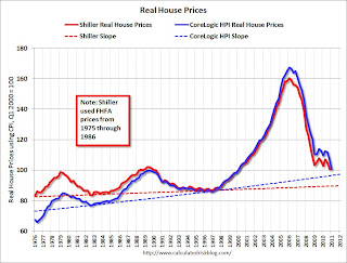 The third graph shows the upward slope for both real price indexes. Even the Shiller Irrational Exuberance real price index has an upward slope - and the CoreLogic upward slope is steeper.
Sure - house prices could overshoot to the downside. But the projection on the first graph of close to 25% in further real price declines is probably excessive. Right now the real CoreLogic HPI is less than 5% above the trend line (it could overshoot), and the Case-Shiller national index will probably decline sharply in Q1 too and not be far above the trend line.
So - back to Dr. Altig's post - I don't think we have to choose between real prices and price-to-rent graphs to ask "how far out of line are house prices?" I think they are both showing that prices are not far above the historical lows. Prices might overshoot to the downside because of supply and demand issues; there is a large overhang of vacant housing units and many distressed properties still coming on the market, plus demand is soft with weak employment, fairly tight financing, negative home buying sentiment and some usual buyers excluded because of credit issues. But I don't think national real prices are that far out of line.
Note: usually near the end of a housing bust - after nominal prices stop falling - real prices decline slowly for a couple more years, and we will probably see that this time too. Of course, right now, nominal prices are still falling.
Earlier:
• Summary for Week Ending May 13th
• Schedule for Week of May 15th


